

The Game of Colours in Web Design: What Actually Matters in 2026
Colour in web design is now governed by contrast and accessibility, not psychology. Under WCAG 2.2 level AA, body text needs a contrast ratio of at least 4.5:1 and large text and interface components need at least 3:1. Build from one brand colour, one neutral scale and four functional colours, define them as reusable tokens, and never let colour be the only signal.

Mukesh Ram
As the Founder and CEO at Acquaint Softtech, I have watched more launch dates slip over colour than over almost any other design decision. Not because the palette was ugly, but because nobody agreed what the colours were for. Someone picks a shade in a review, someone else changes it in the build, and by the time the site ships there are eleven greys in the stylesheet and no rule explaining any of them. Getting that right is part of every software product development engagement we run, and it is far more procedural than most people expect.
The cost arrives later and lands somewhere unexpected. Support tickets about unreadable text. An accessibility audit that fails on the primary button. A rebrand that takes three weeks instead of three days, because the brand colour was hard-coded into two hundred files. Colour is the cheapest thing to decide and one of the most expensive things to change, and in 2026 it is also the part of design most likely to attract a compliance problem.

- You are choosing a colour scheme for a new website or product and want a defensible method.
- Your site has grown a dozen near-identical greys nobody can account for.
- You have been told your site must meet accessibility standards and do not know where to start.
- You are adding dark mode, and your existing palette is falling apart in it.
- You are being asked whether changing a button colour will lift conversions.
Across 1,300+ delivered projects, the pattern is consistent: teams that define colour as a small set of named decisions ship faster and rebrand cheaply, and teams that treat colour as a series of one-off aesthetic choices accumulate a mess they eventually pay a developer to untangle. You can see the interface work behind that discipline across our portfolio of delivered products.
This guide keeps the useful parts of the original article, corrects the parts that no longer hold, and adds the three things it never covered: contrast, compliance and dark mode. Everything here is testable, which is the point.
Find Your Problem and Get the Solution

Every rule in this guide exists because something in a real project broke. This table maps the symptom you are living with to the section that fixes it.
The problem you have | The 2026 fix |
Users say text is hard to read | Raise contrast to 4.5:1 and drop pure black |
You failed an accessibility audit | Fix contrast, focus states and colour-only signals |
Your stylesheet has eleven greys | One neutral scale defined as named tokens |
Your brand colour looks wrong on screen | Create a darker on-screen variant for text |
Colour choices restart every sprint | Name tokens by role, not by appearance |
Your palette offends in some markets | Keep functional colours conventional |
Dark mode looks muddy | Rebuild it from tokens; do not invert |
Nobody notices your main button | Fix hierarchy first, then test colour |
A rebrand would take weeks | Move colours into one token file |
Why Colour Decisions Go Wrong

Most bad colour outcomes come from one of four causes, and none of them is bad taste. Recognising which one you have tells you what to fix.
The palette was never written down
If your colours live in a Figma file and a designer's memory rather than in named tokens, every new screen is a fresh negotiation. This is the single most common cause of the eleven-greys problem, and it compounds quietly for years.
Brand colours were used without adjustment
The original article recommended using logo colours for consistency, which is still sound advice. What it missed is that a brand colour chosen for a printed logo often fails on screen. Many corporate blues and yellows sit at a contrast ratio well below the readable threshold when used for text, so they need a darker on-screen variant rather than direct reuse.
Colour was asked to carry meaning on its own
Red for error and green for success are useful conventions, but if the only signal is the colour, roughly one in twelve men and one in two hundred women will miss it. Every colour signal needs a second cue: an icon, a label, or a weight change.
Nobody tested it on real hardware
A palette approved on a calibrated studio monitor behaves differently on a three-year-old laptop in a bright office. Low-contrast greys are the usual casualty. If your team has never checked the design on cheap hardware in daylight, the palette has not really been reviewed.
The Contrast Rules You Cannot Ignore

Contrast is the one part of colour design with hard, testable numbers. According to the W3C's Web Content Accessibility Guidelines 2.2, body text must reach a contrast ratio of at least 4.5:1 against its background to meet level AA, while large text and non-text elements such as icons, form borders and focus indicators need at least 3:1.
Element | Minimum ratio (AA) | Stricter target (AAA) |
Body text | 4.5:1 | 7:1 |
Large text (24px+, or 19px bold) | 3:1 | 4.5:1 |
Icons and interface components | 3:1 | Not defined |
Focus indicators | 3:1 | 3:1 |
Disabled controls | No requirement | Still aim for legibility |
What this means in practice
Three habits fix most failures. Stop using pure black on pure white, because the extreme contrast causes visual fatigue during long reading; a near-black around #1F2937 on an off-white around #FAFAFA reads more comfortably and still passes comfortably. Stop using mid-grey placeholder text, which rarely reaches 4.5:1. And check your primary button, because a brand colour with white text on it is the most commonly failed element on any site.
The original article's advice that black and white is the best background and text combination was close but not quite right. Near-black on off-white is better, and the reason is legibility over long sessions rather than aesthetics.
Accessibility Is Now a Legal Requirement
This is the biggest change since this article was first written, and it is the part most teams have not absorbed. Accessible colour moved from good practice to obligation in several major markets.
In the European Union, the European Accessibility Act applies from June 2025 and brings consumer-facing digital services such as e-commerce, banking and ticketing into scope. The United Kingdom has long applied the Equality Act to digital services, and public sector bodies work to a specific accessibility standard. In the United States, ADA-related web claims continue to be filed in volume, and Australia applies its Disability Discrimination Act to websites. Different laws, one practical outcome: your colours need to pass.
What actually gets audited
Auditors do not judge your palette. They check specific, mechanical things: text contrast, focus visibility when navigating by keyboard, whether error states are conveyed by more than colour, and whether interface components are distinguishable from their background. All four are colour decisions, and all four are fixable in a day if you catch them early and expensive if you catch them after launch.
For an existing site, this is usually the trigger for a broader clean-up, because a palette that fails contrast is rarely the only thing that has drifted. That work sits naturally alongside version upgrade services, where the stylesheet is being touched anyway.
How to Build a Palette That Survives Contact With Reality
A working palette needs three groups of colour and nothing more: one brand colour, one neutral scale, and a small set of functional colours. The original advice to stay within three or four colours was directionally right; this is the more precise version.
Group | What it covers | How many |
Brand | Primary actions, links, key emphasis | 1 colour, 3 to 5 shades |
Neutral | Text, backgrounds, borders, surfaces | 1 scale, 8 to 10 steps |
Functional | Success, warning, error, information | 4 colours, 2 shades each |
Accent | Optional secondary emphasis | 0 or 1 colour |
Name them by role, not by appearance
Call a token surface-primary or text-muted rather than light-grey-2. Role-based names survive a rebrand; appearance-based names become lies the moment the brand changes. This single convention is what turns a rebrand from a three-week search-and-replace into a one-file change.
Define the scale once, use it everywhere
A neutral scale of eight to ten steps covers almost every interface need, from page background to disabled text. Teams that skip this end up inventing a new grey each sprint. If your front end is React-based, these tokens usually live alongside the component library your hire MERN stack developers maintain, which is the right place for them because that is where they are consumed.
Find out what your palette is costing you before an auditor does
Send me your URL or Figma file and I will run every text and button pair against WCAG 2.2, flag what fails, and return a prioritised fix list within 48 hours. Most sites we check fail on the primary button.
What Each Colour Actually Signals
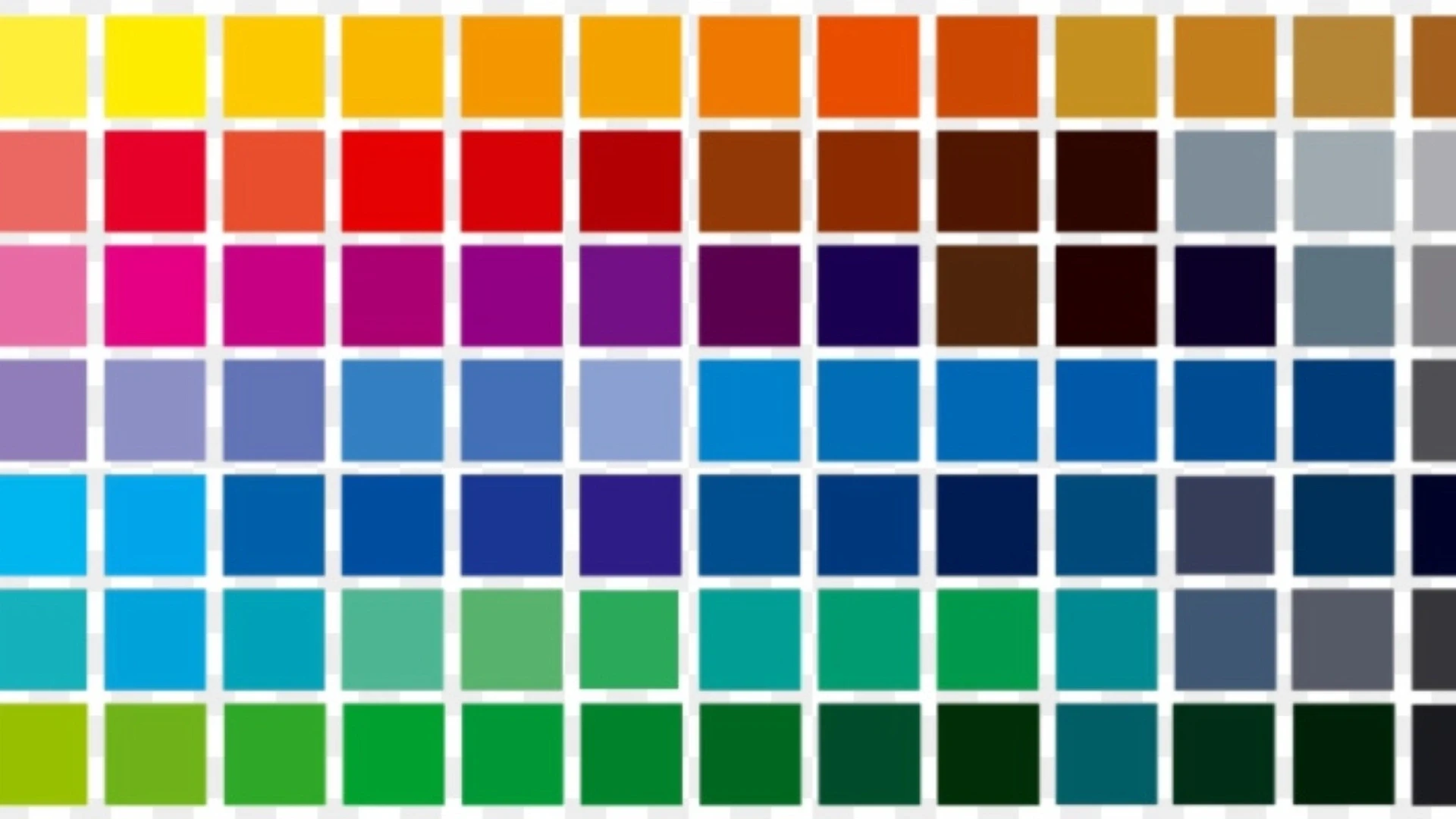
Colour associations are real but weaker and more context-dependent than most marketing writing suggests. Nielsen Norman Group's usability research has long argued that context, familiarity and consistency shape user response far more than hue does. Treat the list below as convention, not psychology.
Colour | Common convention | Where it goes wrong |
Red | Errors, urgency, discounts | Also luck and celebration in much of Asia |
Blue | Trust, stability, finance and tech | Overused; blends into the category |
Green | Success, confirmation, sustainability | Confused with error states by some users |
Orange | Prominent calls to action | Fails contrast with white text very often |
Purple | Premium, creative, wellness | Reads dated in some enterprise contexts |
Black | Luxury, automotive, fashion | Pure black is harsh for extended reading |
Pink | Formerly gendered marketing | Now widely used as a neutral brand colour |
Yellow | Warnings, attention, energy | Rarely passes contrast as text |
The cultural caveat matters more than it used to
The original article was right that responses vary by culture, age and gender, and that point has aged well. If you sell across markets, the safe approach is to keep functional colours conventional and let your brand colour carry the personality. White signals mourning in parts of East Asia; red signals prosperity rather than danger in China. Neither should stop you using them, but both should stop you assuming.
One correction worth making explicitly: the original framing of pink as a colour for products aimed at women is no longer accurate or commercially useful. Pink is now used across fintech, developer tools and healthcare with no gendered intent at all.
Designing for Dark Mode
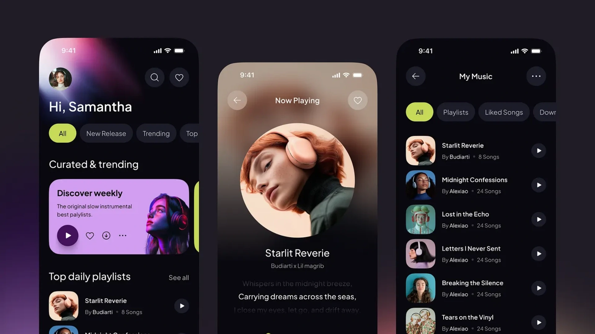
Dark mode is now an expectation rather than a feature, and you cannot produce it by inverting a light palette. Inversion is what makes dark modes look muddy, and it is the most common implementation mistake.
Three rules that fix most dark modes
Avoid pure black backgrounds; a dark grey around #121212 reduces the harsh halo effect around light text on OLED screens. Desaturate your brand colour for dark surfaces, because a saturated colour that reads well on white will vibrate uncomfortably on dark. And express elevation with lighter surfaces rather than shadows, since shadows are effectively invisible against a dark background.
None of this is possible without tokens. If your colours are hard-coded, dark mode becomes a parallel stylesheet that immediately drifts out of sync with the light one. This is precisely why the token work in the previous section pays for itself, and it is a common reason existing sites need support and maintenance budget allocated to a design refactor rather than new features.
Colour and Conversion: What Really Moves the Needle
Button colour affects conversion far less than contrast, placement, and clarity of the label. The widely repeated claim that a specific colour converts better does not survive scrutiny, because the tests behind it changed contrast at the same time as hue.
What consistently works is making the primary action the most visually distinct element on the page, whatever colour it happens to be. If everything on a page is bright, nothing is prominent, which is a more precise version of the original article's warning about adding too much colour.
A useful test
Squint at your page, or blur it heavily. Whatever you still notice is what your users notice first. If that is not the primary action, the problem is hierarchy, not hue. Fix that before running any colour test.
On transactional sites, the stakes are higher, because a confusing action colour costs revenue on every session rather than every campaign. That is why colour hierarchy gets scrutinised closely in ecommerce development work, where the checkout path leaves no room for ambiguity. Our guide to mobile commerce development covers how that hierarchy behaves on small screens, where the constraint is tighter still.
How to Test Your Palette in Under an Hour
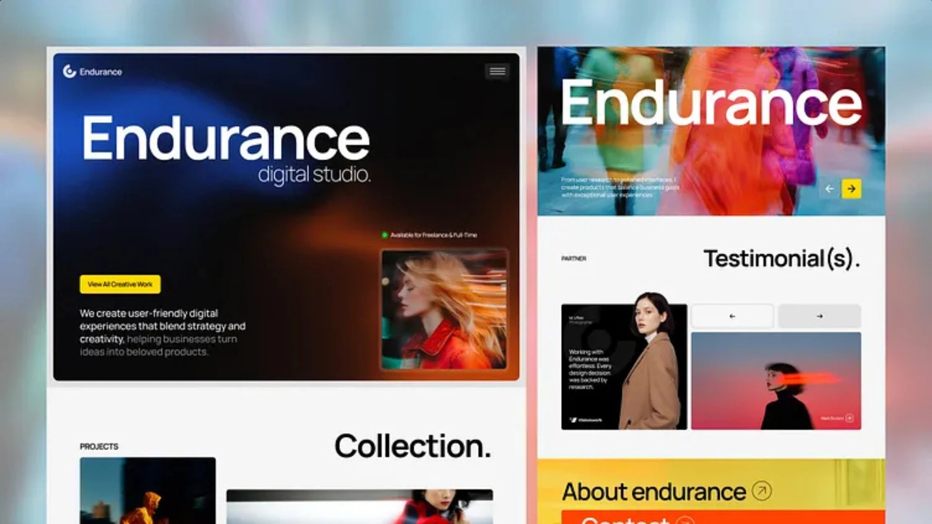
You can validate a palette properly in about an hour, and doing so before build is dramatically cheaper than after. Work through these five checks in order.
The five checks
Run every text and background pair through a contrast checker. Body text must reach 4.5:1. If you created your branding with an AI logo generator, do not assume the exported colours are automatically web-accessible; test the logo colours against your website backgrounds before using them in buttons, navigation, or headings.
Check your primary button, which fails more often than any other element.
Simulate the three common types of colour blindness and confirm nothing becomes ambiguous.
Tab through the page with a keyboard and confirm the focus outline is always visible.
Open the site on a cheap laptop screen in bright light and see what disappears.
If a check fails, fix the token rather than the screen. Fixing screens individually is how palettes fragment in the first place, and it is the difference between a one-hour correction and a recurring one.
Deciding which of these checks becomes a permanent gate in your process, rather than a one-off exercise, is the kind of thing worth settling early in a discovery workshop so it does not get negotiated again on every release.
What a Colour System Costs to Build
Formalising colour is one of the cheapest pieces of design work available, and one of the highest-return. These are estimates from our delivery practice rather than fixed quotes.
Scope | What it includes | Estimated cost (USD) |
Palette and contrast audit | Review, failures list, corrected values | 1,500 to 4,000 |
Token system for one product | Named tokens, scales, documentation | 4,000 to 12,000 |
Dark mode implementation | Second theme built on existing tokens | 6,000 to 18,000 |
Design system with components | Tokens plus reusable component library | 20,000 to 60,000 |
The economics are unusually clear here. A token system that takes a week to define typically removes days of rework from every subsequent release, and it turns a rebrand from a project into a configuration change. For a broader view of where design sits within total build cost, our guide to web application development cost breaks down the other line items.
If you are starting fresh, resist the temptation to build the full system before you have shipped anything. Define the tokens, ship the MVP, and expand the system only where real screens demand it. An MVP development company can help you launch faster with only the essential features.
Stop paying for the same colour decision twice
Book a free 30-minute call, and I will show you exactly what a token system would look like for your product, what it removes from every future release, and what it costs to build. You get the plan in writing afterwards.
Frequently Asked Questions
-
How many colours should a website use?
One brand colour, one neutral scale, and four functional colours. That covers almost every interface need. Add a single accent only if the brand genuinely requires it.
-
What contrast ratio does website text need?
Body text needs at least 4.5:1 against its background. Large text and interface components need at least 3:1. Those are the WCAG 2.2 level AA thresholds.
-
Is black text on a white background best?
Near-black on off-white is better than pure black on pure white. The extreme contrast tires the eyes over long reading. Something like #1F2937 on #FAFAFA works well.
-
Does button colour affect conversion rates?
Far less than most people assume. Contrast, placement, and label clarity matter much more. Make the primary action the most distinct element, whatever its colour.
-
What is a colour token?
A named variable that stores a colour value, such as text-muted or surface-primary. Components reference the name, not the hex code. Changing the value updates everything at once.
-
How do I make my site accessible for colour-blind users?
Never use colour as the only signal. Pair every colour cue with an icon, label, or shape. Then simulate the common types of colour blindness and check that nothing becomes ambiguous.
-
Do I legally have to meet accessibility standards?
In many markets, yes. The European Accessibility Act applies from June 2025 to consumer-facing digital services. The UK, US, and Australia all apply equivalent discrimination laws to websites.
-
Can I just invert my palette for dark mode?
No, and it is the most common mistake. Use a dark grey rather than pure black, desaturate brand colours, and show elevation with lighter surfaces instead of shadows.
-
Should I use my logo colours on the website?
Yes, but usually not unchanged. Print colours often fail contrast on screen. Create a darker on-screen variant for text and buttons.
-
How long does it take to build a colour system?
A palette audit takes a day or two. A documented token system for one product takes about one to two weeks. A full design system with components takes considerably longer.
I love to make a difference. Thus, I started Acquaint Softtech with the vision of making developers easily accessible and affordable to all. Me and my beloved team have been fulfilling this vision for over 15 years now and will continue to get even bigger and better.
Table of Contents
Get Started with Acquaint Softtech
- 13+ Years Delivering Software Excellence
- 1300+ Projects Delivered With Precision
- Official Laravel & Laravel News Partner
- Official Statamic Partner
Related Blog

Bootstrap vs Material
Develop a state-of-the-art solution by picking the best technology after reading more about Bootstrap and Material UI

Shivang P
September 4, 2023
Rome Was Not Built in a Day: The Journey to Developing a Unicorn SaaS
Building a unicorn SaaS company is a marathon, not a sprint. Just like Rome, great products aren’t built overnight. From refining your MVP to scaling for growth.
Mukesh Ram
September 26, 2024
All You Need To Know About Website Development For Music Industry
The forces shaping UX design in 2026 are legal and technical rather than aesthetic. Accessibility is now enforceable law in the EU and UK, deceptive interface patterns are explicitly prohibited under the EU Digital Services Act, and AI features have introduced new design problems around trust, correction and consent. Gradients, illustrations and full-screen video are visual design choices, not user experience decisions, and confusing the two is the most common mistake in this field.
Mukesh Ram
June 1, 2023India (Head Office)
203/204, Shapath-II, Near Silver Leaf Hotel, Opp. Rajpath Club, SG Highway, Ahmedabad-380054, Gujarat
USA
7838 Camino Cielo St, Highland, CA 92346
UK
The Powerhouse, 21 Woodthorpe Road, Ashford, England, TW15 2RP
New Zealand
42 Exler Place, Avondale, Auckland 0600, New Zealand
Canada
141 Skyview Bay NE , Calgary, Alberta, T3N 2K6