How to Design a Digital Marketing Agency Website by Avoiding the Common Mistake
To get noticed as an agency, you must ensure your website stands out. Discover the key to crafting a top-notch digital marketing agency website.

Mukesh Ram
Introduction
Digital Marketing agencies are in a very competitive industry. Many new agencies are popping up daily, meaning clients have more options than ever before. To get noticed as an agency, you must ensure your website stands out. To help achieve this, we've compiled a list of do's and don'ts when designing your digital marketing agency website.
The article will help you identify common mistakes while designing a digital marketing agency website. So, either you hire remote developer or web development firm. If you avoid the common mistakes mentioned in this article your website will become more competitive.
The Importance of a Well-Designed Digital Marketing Agency Website
Your website is the first thing people see when inquiring about your business. This also means it plays a big role in creating the first impression on potential clients. It is thus important to create a well-designed digital marketing agency website that will help you attract more clients and improve your conversion rate.
A well-designed website also reflects your work and professionalism in the field. It also means that you can convert clients with just the help of your website if you do it right and showcase yourself smartly.
Mistakes to Avoid While Building a Website for a Digital Marketing Firm
Now that you know the importance of the website, let's understand what common mistakes you must avoid while building a website. By identifying these common mistakes while building your website, you can save lots of time and effort to grow your business. So, let's understand all the points individually to avoid mistakes.
Too much information
The mistake of overdoing it is easy to make. You want your website to be the best, so you might think to pack the website with tons of information, images and animations. But instead of a positive outcome, it will impact the visitors negatively. Too much data will overwhelm visitors since visitors prefer it simple, clean and uncluttered.
Good practices:
Don't overload your homepage with too much text or images
Don't make your website too complicated or long
Use only one font (two at most) throughout website
Limit yourself to three colours max per page/section
Do you know: According to Statista reports, in the year 2022, the digital advertising sector in India experienced substantial growth, reaching a market size of nearly 300 billion Indian rupees. A significant leap compared to the 2016 market size. And expected it to exceed half a trillion Indian rupees by 2024. This trend reflects the upward trajectory witnessed in recent years.
Making it complicated

It's important to remember the purpose of your digital marketing agency website. The website conveys information about what you do and how it can benefit potential clients. People get confused if you place unnecessary details in an attempt to be more creative. If people are confused by what they see when they land on your site and unable to find what they are looking for, their first impression of your business will be bad and that will take a long time to fix.
The key factors to make a good first impression include following a minimalistic approach, avoiding unnecessary visuals as well as text, highlighting important bits, ensuring ease of navigation and clearly mentioning what the website is all about.
This is an effective method of communicating your message and services which will lead to better engagement and conversion rates.
Supercharge Your Digital Presence with a Website
Skyrocket your online reach and conversions with a tailor-made website designed for your digital marketing agency. Consult the experts today and embark on your digital success journey.
Writing for search engines

Opting for SEO is the next best thing to rank higher at Google, but at what cost? The goal is to concisely convey what value you can provide your clients with your services. It would help if you always write for the readers, not the search engines. This is a common mistake many digital marketing agency owners make when trying to rank higher in search engine results pages (SERPs).
Avoid these mistakes for success:
Use keywords in your content, but don't overdo it: It's important to use keywords in your website copy because this will help people find you on Google or any other search engine. However, visitors love informational content and will browse to another website if it includes too many promotional bits.
Use long tail keywords: Long tail keywords are more specific than broad ones and therefore tend to have less competition when it comes time for them to rank well on SERPs.
Use subheadings and bullet points: Subheadings break up large chunks of text into smaller ones, making them easier for people not used to reading lots at once. Also, using bullet points within each section helps readers quickly scan through what they want without getting overwhelmed by too much information at once.
Slow website

Speed and performance are critical for SEO. Using an Index Checker can also help agencies confirm whether important website pages are properly indexed and visible in search results Google wants to give its users the best results, so it will prioritize websites that load quickly and efficiently over those that don't.
The first thing you can do to improve speed is measure it. There are lots of tools available online that will help you track how long your website takes to load, including Chrome DevTools (for desktop), Page Speed Insights (for mobile), GTMetrix or Pingdom Tools (for web hosting). You may also want to look into optimizing images for faster loading times.
If you hire developers, they can code efficiently, making your website load faster. You can also opt for a different coding language that is scalable and lightweight. For example, more and more people are shifting towards Laravel development as it has some great features.
So, remember that you hire someone with great skills to code efficiently.
Pages with purpose
Web pages have purpose and meaning. That's the reason they all have different styles and copies. So, you must add all crucial web pages with some purpose. Every website has a home page, a contact page and an about us page. These are all examples of "content" or "information." If you don't have these types of pages on your site, then people won't know where they should go when they land on your site or how they can get in touch with you if they want more information.
The best way to avoid this mistake is by ensuring that all your content has a purpose and can easily be found by visitors who visit the site through search engines. So, avoid naming the web pages with different names and add the necessary details to the web pages it needs.
Not using a clear navigation system.
The navigation system is one of the most important parts of your website. Visitors use it to get around, and if it's not easy to use, people will leave. Employing a clear navigation system is paramount when designing a digital marketing agency website. Incorporate breadcrumbs, menus, or sidebars to enhance user experience and ease of exploration.
Breadcrumbs provides a trail of visited pages, enabling users to navigate back effortlessly. Menus should be concise and logically organized, allowing visitors to find desired information quickly.
Sidebars offer supplementary links and relevant content, ensuring easy access to key sections. Consistency in navigation across the website fosters familiarity and user confidence. By implementing these elements, your digital agency website will deliver a seamless browsing experience, boosting engagement and client satisfaction.
Also, make sure you have a good search function. With the search option, users can easily find what they're looking for without scrolling through dozens of pages. You can also go with MVP development if you don't know which web pages to add.
Not focusing on the CTA button.
CTAs are the primary way to get your visitors to take action. They're the buttons that say "sign up now," "buy now" or "learn more." Without them, you won't be able to convert visitors into customers - bad news for your business. An example of a company using CTAs correctly is The Digital PR agency, they have a consistent CTA through out the site encouraging users to "Schedule your free consultation"
The most important thing is that you use them! But don't just slap a bunch of buttons on your website randomly. You must ensure they're placed where people can see them easily while browsing content. You also want them spaced out enough so they don't feel cramped together but close enough so users don't have far distances between each one when they click on something new during their visit.
Case Study
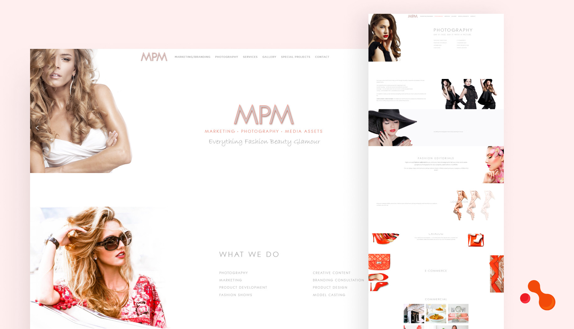
As a leading Laravel development solutions and web and application development solutions provider we worked with various businesses. We recently helped a marketing agency to make something beautiful and purposeful with WordPress, a website that markets their services. Now we had a purpose in mind. We had a brief idea of what we had to do.
With a well-designed website using Photoshop, we created a great first impression for the viewers. The purpose is to showcase their services effortlessly, so we did not provide unnecessary black spaces and utilized each section with an objective. Like earlier, we followed that system thoroughly and avoided all common mistakes.
Our developers also made the website fast and easy to navigate. We used JavaScript for coding. The purpose of JavaScript is to make the website fast and smooth. We also smartly integrated CTAs and added web pages that define what MPM provides. Overall, we made a website that looks outstanding and creates a great first impression.
Conclusion
Your website represents your business and plays a big role in shaping your image. It should be designed with care and professionalism so potential clients can see the service. If you see these common mistakes on your website, then fix them as soon as possible. If you plan to redesign the website, ensure you are not making these mistakes.
I hope you take away some great value from this article. Attempting this by yourself is not as easy as you might imagine, hence we are here to help. Contact us to know more about making your online presence outstanding with a digital marketing agency website development.
FAQ : How to Design a Digital Marketing Agency Website by Avoiding the Common Mistake
-
What is a digital marketing agency website?
A digital marketing agency website is an online platform that showcases a digital marketing agency's services, expertise, and past successes. It serves as a hub for potential clients to learn about the agency's offerings, team, and achievements while providing a means for client engagement and inquiries.
-
Do I need a website for my marketing agency?
Yes, having a website for your marketing agency is essential. It is a digital storefront showcasing your services, expertise, and portfolio. It allows potential clients to find you online, builds credibility, and provides a platform to demonstrate your value in the competitive market.
-
How much does it cost to make a digital marketing agency website?
The cost of making a digital marketing agency website can vary depending on factors such as the website's complexity, features, design, and the web development team's rates. Generally, a professional website can range from $3,000 to and goes upto $15,000 and more, depending on the client's requirements.
-
What kind of website should a digital marketing agency have?
A digital marketing agency should have a dynamic and engaging website that showcases its expertise, services, and successful past campaigns. The website should be visually appealing, reflecting the agency's branding and personality. It must prioritize user experience with intuitive navigation and easy-to-find information.
Table of Contents
Get Started with Acquaint Softtech
- 13+ Years Delivering Software Excellence
- 1300+ Projects Delivered With Precision
- Official Laravel & Laravel News Partner
- Official Statamic Partner
