

The Future of UX Design Trends: What Actually Matters in 2026
The forces shaping UX design in 2026 are legal and technical rather than aesthetic. Accessibility is now enforceable law in the EU and UK, deceptive interface patterns are explicitly prohibited under the EU Digital Services Act, and AI features have introduced new design problems around trust, correction and consent. Gradients, illustrations and full-screen video are visual design choices, not user experience decisions, and confusing the two is the most common mistake in this field.

Mukesh Ram
As the Founder and CEO at Acquaint Softtech, I want to start by disagreeing with the article this replaces, including the parts I approved at the time. It listed five UX trends: content-led design, full-screen video, typography, gradients and illustrations. Every one of those is a visual design choice. None of them is user experience. A site can have beautiful gradients and still fail the person trying to cancel a subscription on a phone, and in our software product development work that gap is where most of the expensive problems live.
The distinction is not pedantry, and it predates all of us. ISO 9241-210, the international standard for human-centred design, defines user experience as a person's perceptions and responses resulting from the use of a product, and describes a process for achieving it: understand the context, specify the requirements, design, then evaluate against real users. Aesthetics appear in that process as one input among several. Treating them as the whole of UX is how teams end up redesigning a homepage while the checkout stays broken.

- You are being asked to follow UX trends and suspect they are really style trends.
- Your product sells into the EU or UK and accessibility has become a compliance question.
- You are adding AI features and are unsure how to design for wrong answers.
- Your growth team has proposed something that feels manipulative.
- You are budgeting design work across the US, UK, Europe or Australia.
There is one more problem with the original worth naming. It was written in the future tense about 2018, promising trends that would continue to impress that year. An article whose central promise expired eight years ago is worse than an out-of-date one, because it reads as current to anyone who does not check the date.
So this version drops the forecasting. It covers what has already changed and is now enforceable, what AI has genuinely introduced, and which of the original five still deserve attention when you get to the visual layer.
Is Your Problem UX or Visual Design?
Sorting the two saves most of the money wasted on design projects. Find the complaint you are hearing and check which column it belongs in.
The complaint you hear | What it actually is |
The site looks dated | Visual design |
Users cannot find the pricing | UX, information architecture |
The form gets abandoned | UX, task flow |
Nobody notices the main button | Both |
Screen readers cannot use it | UX, accessibility |
Everything feels slow | UX, engineering |
Cancelling is hard on purpose | Compliance risk |
The AI answer was wrong | UX, AI interaction |
Only the first row is solved by a designer working on visuals alone. The rest need research, engineering or a policy decision, which is why design budgets spent entirely on appearance so often produce a prettier version of the same problem. Working out which row a complaint sits in is the first hour of any discovery workshop services session we run on an existing product.
Why the 2018 List Was Not About UX
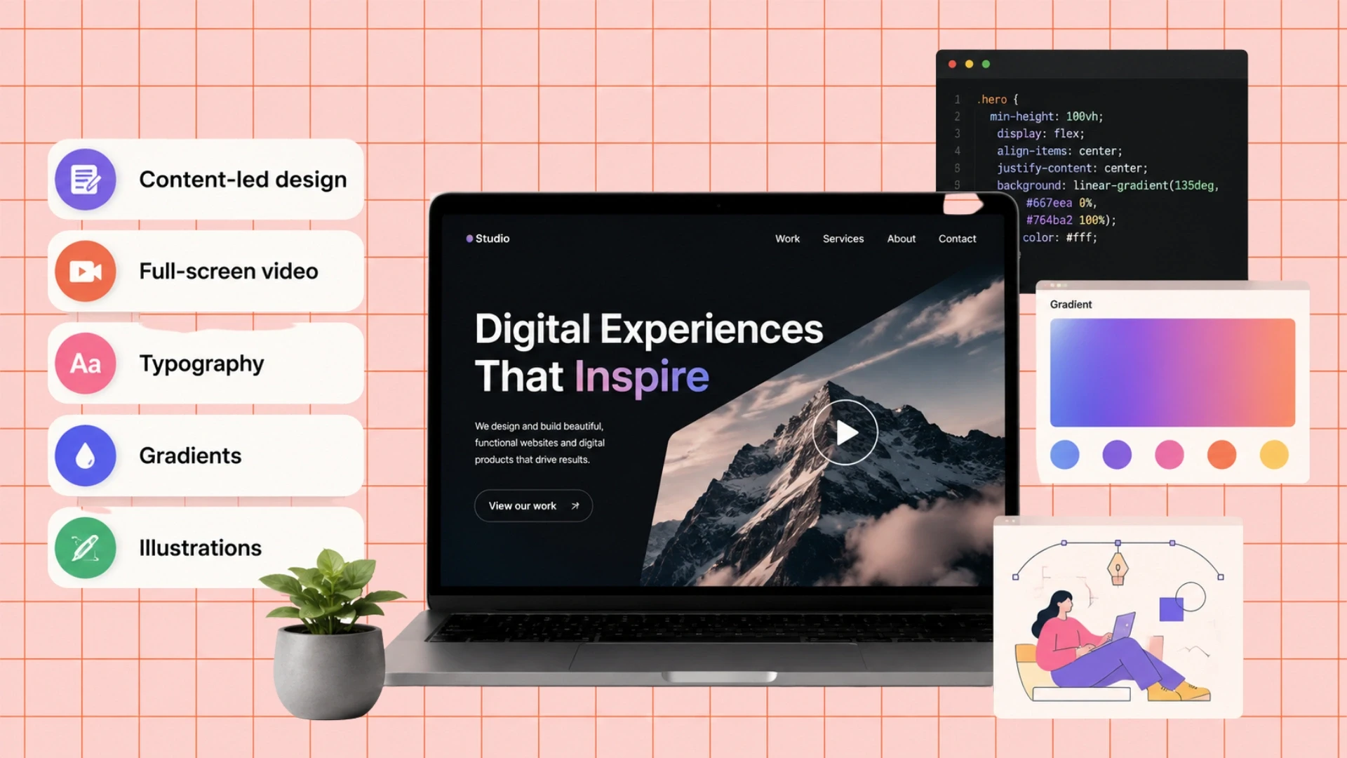
Four of the five original trends survived as visual conventions, and none of them ever affected task success. Here is the honest verdict on each, because they still get recommended.
2018 trend | Status in 2026 | The UX caveat |
Content-led design | Still sound | Clarity beats volume; long is not deep |
Full-screen video | Faded | Heavy, hurts load time, often muted anyway |
Typography | Timeless | Size and contrast matter more than the face |
Gradients | Cyclical, currently back | Check contrast where text sits on them |
Illustrations | Still effective | Never carry meaning in an image alone |
Full-screen video is the clearest casualty and the reason is measurable rather than fashionable. A large autoplaying video is one of the heaviest things you can put above the fold, it delays the largest contentful paint, and most browsers mute it by default so the audio you designed around never plays. It looked impressive in a portfolio and performed badly in analytics, which is a fair summary of visual trends generally.
Gradients returned, which is worth using as a lesson about trend articles. Visual fashion is cyclical, so following it produces work that ages in a predictable loop. The things in the next section do not cycle, because they are driven by law and by capability rather than by taste.
Not sure whether you need a designer or an engineer?
Send me the complaints your users are making, and I will tell you which are technical design problems, and what each would take to fix.
The 6 Shifts That Actually Matter Now
These six changed what good UX means, and none of them is a style. Two are legal obligations, three are technical, and one is a change in what users expect.
Accessibility moved from good practice to legal requirement
This is the largest shift since the original article and it did not exist as a business risk in 2018. The European Accessibility Act has applied since June 2025 to consumer-facing digital services, and the UK, US and Australia apply equivalent discrimination law to websites and apps. The measurable standard is WCAG, and version 2.2 added criteria that catch problems teams routinely ship.
The W3C's summary of what is new in WCAG 2.2 is worth reading in full, but four additions cause most failures: interactive targets must be large enough to hit reliably, focus indicators must be visible and not obscured by sticky headers, anything achievable by dragging must have a single-pointer alternative, and authentication must not depend on a cognitive test such as remembering or transcribing a code without an alternative.
Deceptive interface patterns became a legal exposure
Practices that were once described as growth tactics are now named in legislation. This gets its own section further down because it is the change most likely to affect what your product team is currently planning.
AI arrived in the interface, and brought new failure modes
Generative features introduced a design problem that did not previously esxist: the system can be confidently wrong. Traditional interfaces either worked or produced an error. An AI feature can produce a fluent, plausible, incorrect answer, and the user has no signal that anything failed. This is especially visible in Conversational AI, where a natural, well-paced voice response can make an incorrect answer sound just as authoritative as a correct one the fluency of delivery gives no indication of the system's actual confidence or accuracy. Designing for that is covered in its own section below, and it is where most of the genuinely new UX thinking is happening.
Speed became a design constraint rather than an engineering afterthought
Responsiveness is now measured, published and tied to how pages are ranked and how users behave. The practical consequence for designers is that a performance budget belongs in the brief alongside the brand guidelines, because a design approved without one reliably exceeds it. If a hero image, three web fonts and an animation library are approved separately, nobody ever says no.
Personalisation collided with privacy
Users expect relevance and simultaneously object to being tracked, and consent rules mean you often cannot have the data you would need for the first. The workable answer is personalisation from declared preferences and in-session behaviour rather than cross-site tracking, which is less powerful and considerably more defensible. Ask people what they want rather than inferring it, then honour the answer visibly.
Design systems replaced page-by-page design
Mature teams no longer design screens; they design components with defined tokens for colour, spacing and type, then assemble screens from them. The benefit is consistency and speed, and the risk is that a system built without accessibility baked into its components multiplies the same defect across every screen. Fix contrast and focus states once, in the component, and the whole product improves. Our comparison of Bootstrap and Material UI covers the trade-offs when choosing a foundation to build that on.
Designing AI Features People Will Trust
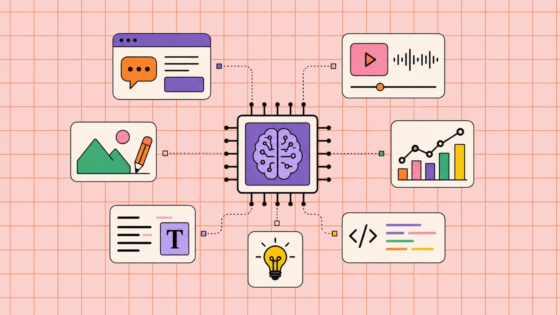
An AI feature needs three things a conventional feature does not: a way to show uncertainty, a way to correct it, and a way to leave. Products that skip these get abandoned quietly after the first confidently wrong answer.
Show where the answer came from
Citations, source links or a visible reference to the underlying record turn an assertion into something checkable. This is not only about honesty; it changes behaviour. Users who can verify an answer will use the feature for higher-stakes tasks, and users who cannot will restrict it to trivial ones regardless of how accurate it actually is.
Make correction cheap and obvious
Assume the output will sometimes be wrong and design the recovery path first. Editable results, a clear undo, and a visible route to a human all reduce the cost of an error from abandonment to a minor annoyance. The worst pattern is an AI action that is applied automatically and is difficult to reverse, because a single bad experience there ends the user's trust in the whole product.
Never let the AI be the only path
Keep the conventional interface working alongside the conversational one. People fall back to menus and forms when they are in a hurry, when the model misunderstands them, or when they simply prefer it. Replacing a working interface with a chat box is the most common AI design mistake we are asked to undo.
Be explicit about what happens to the input
State plainly whether entered data is stored, whether it trains a model, and how to opt out. Under EU and UK rules this is a compliance matter as well as a trust one, and vagueness here is increasingly read as intent to obscure.
These decisions sit between design and engineering, which is why they work best when the people building the model behaviour and the people designing the screens are in the same conversation. It is the pattern behind our work on an AI-powered guest experience platform, and the reason teams increasingly hire AI/ML engineers alongside designers rather than sequentially.
The Interface Patterns That Became Illegal
Deceptive design is now named and prohibited in EU law, and treated as actionable conduct by US regulators. If your roadmap includes anything below, it is a legal question rather than a design debate.
Article 25 of the EU Digital Services Act prohibits online platforms from designing or operating interfaces in ways that deceive or manipulate users, or otherwise distort their ability to make free and informed decisions. It is the first EU law to use the term dark patterns directly, and it sits alongside existing consumer protection and data protection rules that already covered some of the same ground.
The patterns most likely to be in your backlog
Pattern | What it looks like | Why it is now a risk |
Hard cancellation | Sign up online, cancel by phone | Regulators expect symmetry |
Confirmshaming | Decline button worded to shame | Treated as manipulation |
Pre-ticked consent | Opt-in selected by default | Invalidates consent |
Unbalanced choices | Accept prominent, reject hidden | Consent not freely given |
Fake urgency | Invented countdowns or stock levels | Misleading commercial practice |
Nagging | Repeated prompts after refusal | Erodes the validity of the refusal |
The position in the United States
Federal rules on subscription cancellation have had a contested legal history, so the reliable statement is this: regulators can and do act on deceptive design under existing consumer protection powers regardless of any single rule's status, and several state privacy laws explicitly define deceptive design and treat consent obtained through it as invalid. Because this area is moving, verify the current position before relying on it rather than treating any article, including this one, as settled.
The practical test
Ask whether a user who fully understood the interface would still make the same choice. If the answer depends on them not noticing something, you have a dark pattern rather than a conversion optimisation. For subscription and retail products this is now a routine review item, and it is one of the things we check during ecommerce development work rather than leaving it to be discovered by a regulator or a journalist.
Does your product meet the new accessibility rules?
Book a free 30-minute call and I will review your key journeys against WCAG 2.2, flag the failures that matter most, and tell you what remediation would involve.
What UX Work Costs
UX work is cheaper than the redesigns it prevents, and considerably cheaper offshore. These are prevailing market ranges rather than fixed quotes.
Location | Senior design and front-end rate | Relative cost |
New York, USA | USD 110 to 200 / hour | Highest |
United States (national) | USD 90 to 170 / hour | Very high |
Australia | AUD 110 to 200 / hour | High |
United Kingdom | GBP 65 to 130 / hour | High |
Europe (EU) | EUR 70 to 140 / hour | High |
India (Acquaint Softtech) | USD 25 to 49 / hour | Up to 40% lower |
Work | What it delivers | Estimated cost (USD) |
Usability testing round | 5 to 8 sessions, ranked findings | 3,000 to 9,000 |
WCAG 2.2 audit | Prioritised failures with fixes | 3,000 to 12,000 |
Accessibility remediation | Contrast, focus, targets, labels | 5,000 to 25,000 |
Single journey redesign | Checkout, onboarding or signup | 8,000 to 30,000 |
Design system foundation | Tokens, core components, docs | 20,000 to 70,000 |
One sequencing note worth more than the numbers. Testing before designing is the cheapest item on the list and the most frequently skipped, and five sessions with real users will usually tell you that the problem is not the one you were about to spend thirty thousand dollars solving. For how these figures sit inside a wider build budget, our guide to web application development cost covers the surrounding line items.
Accessibility fixes also behave differently from other design work: applied at the component level they propagate everywhere at once, which makes them unusually good value. Keeping them from regressing as the product changes is ongoing rather than one-off, and it belongs in support and maintenance services rather than being re-audited from scratch every second year.
Fix the journey that is costing you, customers
Book a free 30-minute call, and I will look at your highest-value journey, show you where users drop out, and scope the fix with a timeline and a cost.
Frequently Asked Questions
-
What are the UX design trends for 2026?
Accessibility as a legal requirement, regulation of deceptive interface patterns, AI features that must show uncertainty and allow correction, performance budgets, privacy-respecting personalisation and component-based design systems.
-
What is the difference between UX and visual design?
Visual design covers how something looks. UX covers whether someone can complete their task. A site can look excellent and still fail the person trying to cancel a subscription.
-
Is accessibility legally required for websites?
In many markets yes. The European Accessibility Act has applied since June 2025 to consumer-facing digital services, and the UK, US and Australia apply equivalent discrimination law.
-
What changed in WCAG 2.2?
New criteria covering minimum target size, visible focus indicators that are not obscured, alternatives to dragging, and authentication that does not rely on a cognitive test.
-
Are dark patterns illegal?
In the EU, Article 25 of the Digital Services Act prohibits deceptive or manipulative interfaces on online platforms. US regulators act under existing consumer protection powers, and several state laws treat consent obtained through deceptive design as invalid.
-
How do I design AI features users will trust?
Show where answers come from, make correction and undo easy, keep the conventional interface available alongside the AI, and state clearly what happens to anything users type in.
-
Is full-screen video still a good idea?
Rarely. It is heavy, delays your largest contentful paint, and is usually muted by default so the audio never plays. Use a short poster image and let the user choose to play.
-
How much does a UX audit cost?
A usability testing round runs about USD 3,000 to 9,000 and a WCAG 2.2 audit USD 3,000 to 12,000. Both are far cheaper than the redesign they usually prevent.
-
Should I redesign or test first?
Test first, almost always. Five to eight sessions frequently reveal that the real problem is not the one the redesign was scoped to solve.
-
Do design systems improve accessibility?
They can multiply it in either direction. Fix contrast and focus states inside a component and every screen improves at once; ship them broken and the defect appears everywhere.
I love to make a difference. Thus, I started Acquaint Softtech with the vision of making developers easily accessible and affordable to all. Me and my beloved team have been fulfilling this vision for over 15 years now and will continue to get even bigger and better.
Table of Contents
Get Started with Acquaint Softtech
- 13+ Years Delivering Software Excellence
- 1300+ Projects Delivered With Precision
- Official Laravel & Laravel News Partner
- Official Statamic Partner
Related Blog

Mobile Commerce Development: Native Apps, React Native, and PWAs for E-Commerce
Mobile commerce development is the practice of building shopping experiences for mobile devices through native apps, cross-platform React Native apps, or Progressive Web Apps. Native apps offer the highest performance and retention, React Native delivers both platforms from one codebase at 40 to 60 percent lower cost, and PWAs give app-like speed in the browser with zero install friction.

Manish Patel
June 26, 2026
Rome Was Not Built in a Day: The Journey to Developing a Unicorn SaaS
Building a unicorn SaaS company is a marathon, not a sprint. Just like Rome, great products aren’t built overnight. From refining your MVP to scaling for growth.
Mukesh Ram
September 26, 2024
10 Must Follow Steps of Mobile App Development Process
The mobile app development process is a structured set of 10 steps that moves an idea from concept to a published app: ideation, target audience and monetization, choosing the platform, UI/UX design, picking tools, choosing the right partner, fast development, testing and deployment, marketing, and post-launch maintenance. Following the steps in order, rather than rushing to publish, is what separates apps that get downloads from the ones that get ignored.
Mukesh Ram
July 29, 2019India (Head Office)
203/204, Shapath-II, Near Silver Leaf Hotel, Opp. Rajpath Club, SG Highway, Ahmedabad-380054, Gujarat
USA
7838 Camino Cielo St, Highland, CA 92346
UK
The Powerhouse, 21 Woodthorpe Road, Ashford, England, TW15 2RP
New Zealand
42 Exler Place, Avondale, Auckland 0600, New Zealand
Canada
141 Skyview Bay NE , Calgary, Alberta, T3N 2K6