6 Ways To Present Your Web Design To The Client
It can be tricky to present web design to a client who is overseas. But no worries. Here are 6 easy ways you can show your web design to your clients.

Mukesh Ram
You may have designed a great web design mockup for your client, but if you fail to present it right, all your effort may flush down into the gutter. And nobody would want that to happen.
So, if you want to present your web design mockup to your client like a pro, you need to choose the best option. But there are only a few methods, and each one has its pros and cons. Thus, deciding which one to select can give you a tough time. Don’t worry, our guide to clear the clog of confusion.
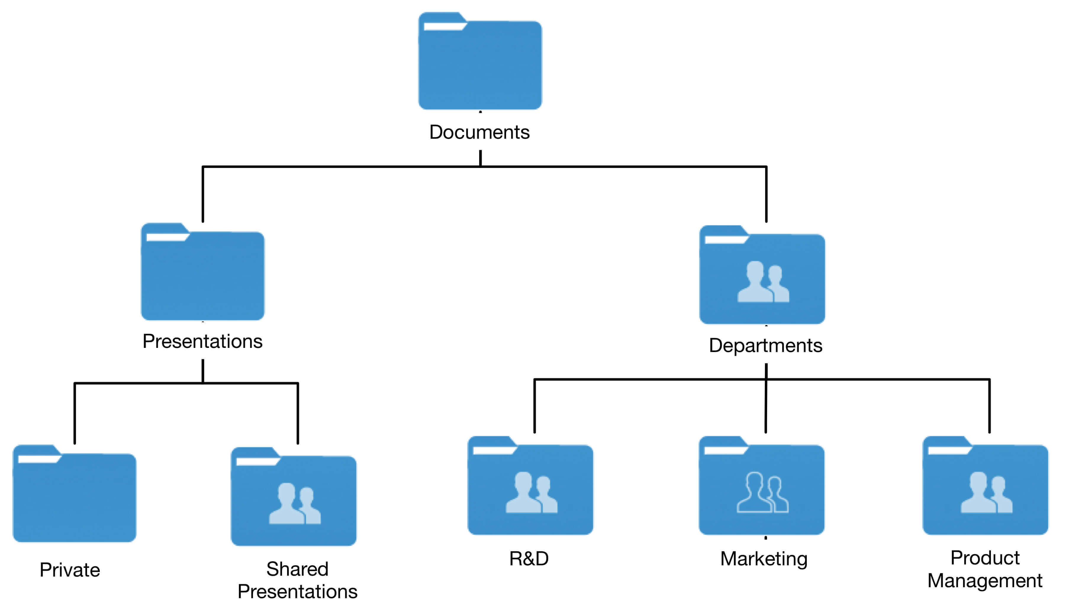
Way #1 – Present image in a subfolder or subdirectory of the site
Using this option, you can upload an image to your site and provide the URL to the client, or you can upload them directly to your client’s demo site and ask them to check. The pros and cons of using this method are:
Pros:
Easy to upload
Clients can check online, which seems more real
Cons:
It may be difficult for non-tech savvy clients to understand why links don’t work
Images may appear smaller than they should so either you need to keep the client informed beforehand or stay prepared to answer questions
Way #2 – Present mockup via email
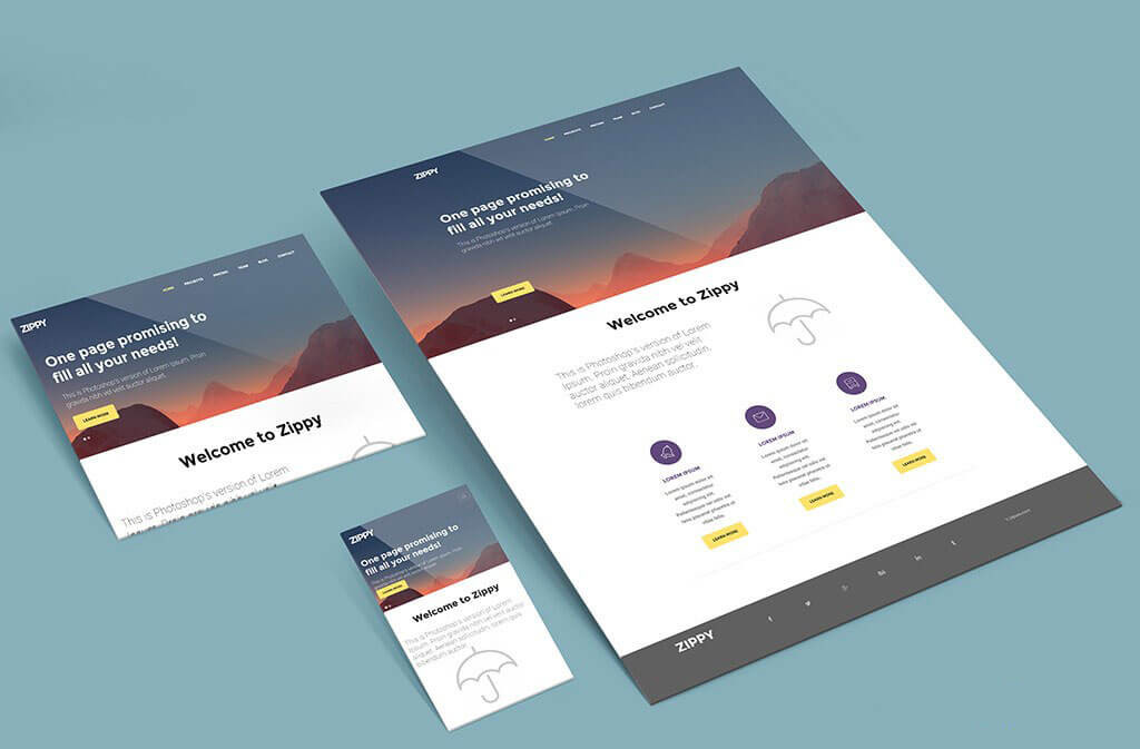
Once you have prepared an image of the mockup, mail it to your client instead of uploading it to a dummy site.
Pros:
This is the easiest and the fastest option
You can send the main as well as supporting images such as on desktop screen and mobile device if any. Remember to place them as a good resource for adding the mockup on different devices. This way, clients can get a better idea of how the site will look.
Cons:
The image may appear smaller than it will actually be, and hence the client may need help viewing it in full mode.
Extra space may appear around the image, which will be actually absent when the site is built.
Way #3 – Present it in a PDF format
Converting an image into a PDF is no big task. You can easily save your image as PDF from PhotoShop and other programs.
Pros:
Very easy to implement
A format every client is familiar with and typically understands how the size and extra space work/look
Can add annotations
Cons:
None really
Way #4 – Present using a preview site
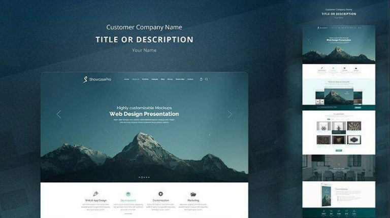
You can make use of a preview site, such as Preview Dump or other similar sites to generate an HTML preview page in just a few quick steps. Send it to clients to see what the site will look like after it’s been coded.
Pros:
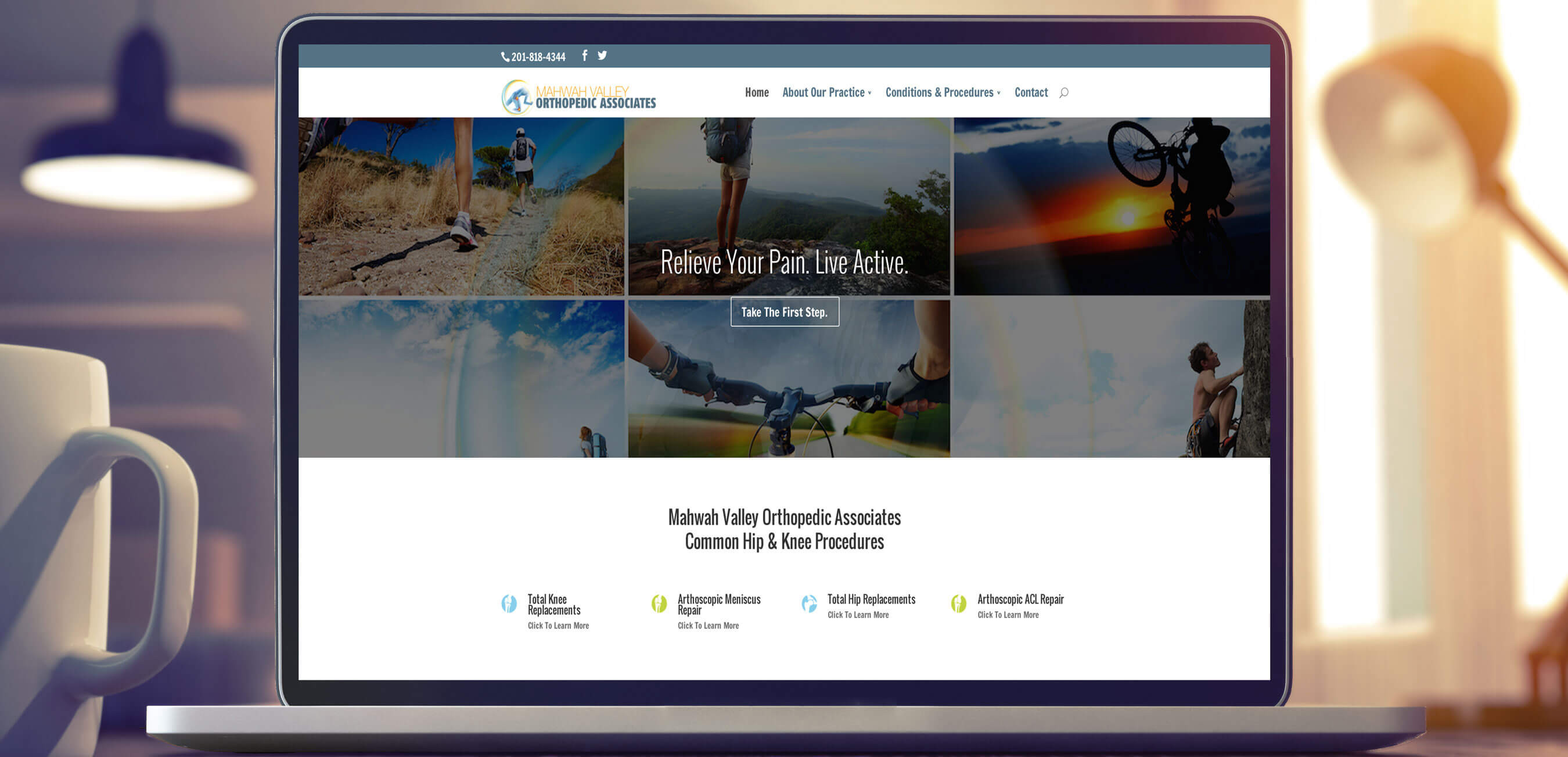
Appears closer to full size
It appears in a browser that will seem more real to the clients
Cons:
Not clickable as with some of the other options
Way #5 – Create a client dashboard
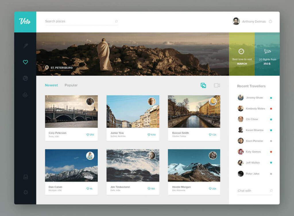
Clients love when you present them with something professional. Set up a dedicated dashboard for them on your own website and give them private access to the mockups and other project files. This can be done in a couple of ways. You can create content that is specific to the user. In this case, you would create a new user for your client and then use a plugin such as User Specific Content. There are also plugins developed specifically for this purpose and have more, such as WP Customer Area. These are good ways to set this up quickly and easily.
Pros:
Clients will get a personal username and password to access the dashboard whenever they want to see mockups of their sites and check for any updates or even a link to see the site in progress as it’s being built
Very professional look and feel
Everything in one place
Cons:
Time-consuming to set-up
Way #6 – Present via a project management tool
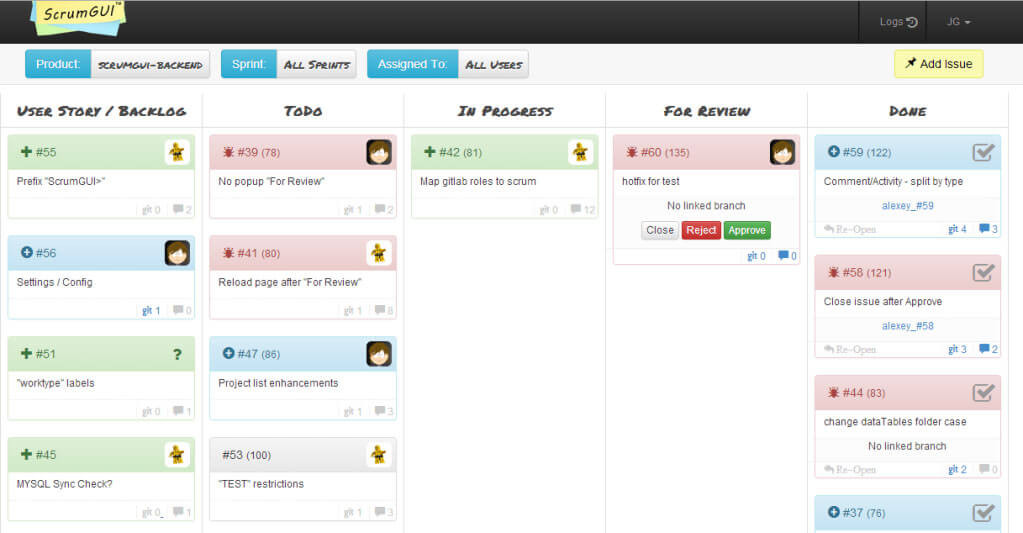
You can easily find a third-party project management tool. It will allow you to upload your design file, add notes, and even make areas clickable. And you need not ask your client to provide feedback as they can directly do it from the tool.
Pros:
Makes the mockup more interactive so it feels more real
Very professional feel
Keeps the project well organized and on track
Cons:
Requires time for set-up and to become familiar with the tool
Monthly fee needed
A few extra presentation tips
Don’t forget to share your reasoning behind the design, no matter how you present it. Even better, explain it at the beginning of the project when your client discusses who his target audience is and what his online business goals are. Explain how the design helps to achieve that and what its benefits are.
This practice will help you give clients another perspective for looking at the design. You will encounter fewer change requests in the future. You will make the client think about the website more strategically rather than just focusing on a “pretty” design.
Another tactic that works very well is to schedule a call to discuss the mockup. Make sure you send it to the client no more than 10-15 minutes before the scheduled call so you can walk them through it. You will not only get instant feedback from the client but will also allow you to explain your work in detail before they focus on minor parts of the site.
Conclusion
We have just shown you the way. The ultimate decision is yours to choose the path which will benefit both you and your client. If you’re just getting started, start simple. Focus on building up some more clients, and then you can improve your presentation as you grow.
Table of Contents
Get Started with Acquaint Softtech
- 13+ Years Delivering Software Excellence
- 1300+ Projects Delivered With Precision
- Official Laravel & Laravel News Partner
- Official Statamic Partner
