

Mobile App UI/UX Design in 2026: Why It Decides Whether Your App Succeeds
Mobile app UI/UX design decides whether people keep an app or delete it, usually within the first minute. UI is how the app looks; UX is whether it actually works for the user. Good design is not decoration, it is retention, conversion and trust, and in 2026 it also means meeting accessibility law and following each platform's conventions. An app that is hard to use fails no matter how good the engineering behind it, which is why design is a business decision, not a cosmetic one.

Mukesh Ram
As the Founder and CEO at Acquaint Softtech, I have watched enough app launches to know where most of them are won or lost, and it is in the first minute. A new user opens your app, and within about sixty seconds they have decided whether it is worth their time or whether it goes to the pile of apps they never open again. They do not make that decision on your code quality or your feature list, which they cannot see.
They make it on whether the app feels clear, quick, and obvious, or confusing and effortful. That judgement is design, and it is why design is not the finishing touch on an app but the thing that determines whether the app gets a second chance at all. This is the reality behind every mobile app development project we take on.

- You are planning an app and deciding how much design matters.
- You are not sure what separates UI from UX.
- Your app works, but users drop off, and you cannot see why.
- You want an app that feels native on both iPhone and Android.
- You need to know what good design costs and how it pays back.
The version of this article had the right instinct: that design matters, and no business should settle for a mediocre interface, but it treated design as mostly a question of looking attractive, and it used the words UI and UX as if they meant the same thing. They do not, and the difference is the whole point.
This article keeps the core conviction and rebuilds everything around it: it separates UI from UX properly, replaces the design tools that have since been discontinued, and adds the parts that now decide an app's fate, accessibility, platform fit, and measurement. Get these right and the first minute goes your way.
The First Minute Decides Everything
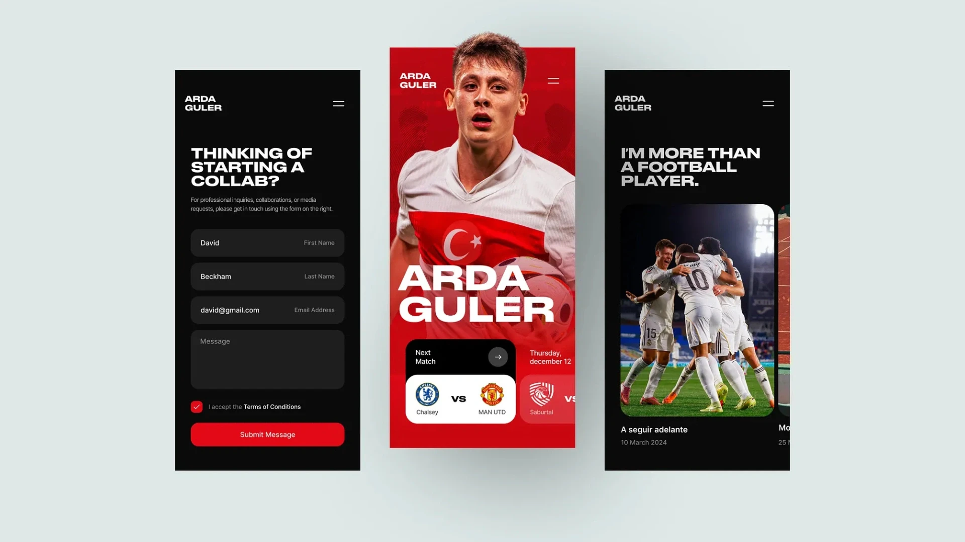
Most users judge an app within its first minute, and that judgement rests entirely on design, not on the engineering they never see. This is why design is the highest-leverage decision in an app, not the last one.
When someone opens your app for the first time, they are not evaluating your architecture or your database; they are asking a simpler question: does this feel easy? If the first screen is cluttered, the next step is unclear, or the app makes them think when they want to just act, they form a verdict quickly, and it is hard to reverse.
A huge share of installed apps are opened once and never again, and the reason is rarely a bug; it is friction. Design is what removes that friction, which makes it the difference between an app that earns a place on someone's phone and one that is quietly deleted. Everything downstream retention, reviews, revenue, follows from surviving that first impression.
UI and UX Are Not the Same Thing

UI is how an app looks; UX is whether it actually works for the person using it. They are different disciplines, and an app needs both. Confusing the two, as the original did, hides the more important half.
| UI (User Interface) | UX (User Experience) |
What it is | The visual layer | The whole experience |
Covers | Colour, layout, type, icons | Flows, structure, ease, logic |
Question it answers | Does it look right? | Does it work for the user? |
Fails when | It looks dated or messy | Tasks are confusing or slow |
Measured by | Visual consistency | Task success, retention |
Here is why the distinction matters in practice: an app can have a beautiful UI and a terrible UX. It can look polished and modern and still frustrate people, because the sign-up is a maze, the key action is buried, or the flow fights the way people actually think. A gorgeous interface on top of a confusing experience is a well-dressed failure.
Good design means both a clear visual layer and an experience that gets out of the user's way, and when a business asks for design help, it usually needs UX work at least as much as UI polish, even when it only asks for the app to look nicer. Naming the two separately is the first step to fixing the right one.
Why Design Is a Business Decision

Design directly drives the numbers a business cares about: how many users stay, how many convert, and how much they trust you. That is why it belongs in the business case, not the cosmetics budget.
Every friction point in an app is a place where someone gives up: a confusing onboarding loses new users, a clumsy checkout loses sales, an unclear screen generates support tickets.
Reduce that friction and the same traffic produces more retained users and more completed actions, without spending a cent more on acquisition. Design is one of the few investments that improves the return on everything else you do, because it lifts the conversion of the users you already have.
That is the honest business argument for it, and it is why we treat design as central to custom software product development rather than as a coat of paint applied at the end. An app people find easy is an app that performs; an app people find awkward leaks value at every step.
Not sure whether your app has a UI problem or a UX problem?
Show me your app or your idea, and I will tell you honestly where users are dropping off, and whether the fix is visual or structural.
The Tools Have Changed: Figma and Design Systems
Modern app design runs on Figma and on design systems, not on the standalone tools of a few years ago. The original's toolset has largely been discontinued or overtaken.
The tools the original recommended have not aged well: Adobe discontinued active development of XD, and the old versions of Sketch it described are long superseded. Today the industry standard is Figma, a collaborative, browser-based tool where designers, developers, and stakeholders work on the same living file together. But the more important shift is not the tool at all; it is the rise of the design system.
A design system is a shared library of reusable components, buttons, forms, colours, and spacing, defined once and used everywhere, so the app stays consistent, is faster to build, and is far easier to change later. For any app beyond the trivial, the design system is what keeps design coherent as the product grows, and it is one of the first things a serious hire react native team sets up so that design and code stay in step. The tool matters less than the system behind it.
Accessibility Is Now the Law
Designing an app so everyone can use it is no longer optional good practice; in Europe it is a legal requirement. The original did not mention accessibility at all, and in 2026 that gap is a liability.
Accessible design means an app works for people with impaired vision, hearing, motor control or cognition: sufficient colour contrast, text that scales, controls usable without precise taps, and compatibility with screen readers. The standard is set by the Web Content Accessibility Guidelines, and in Europe the European Accessibility Act made meeting standards like these a legal obligation for many businesses from June 2025.
Beyond compliance, the reassuring truth is that accessible design is simply better design: the clarity, contrast and structure that help someone using a screen reader make the app easier for everyone. Building accessibility in from the start costs little; retrofitting it after a complaint costs a great deal, which is why we treat it as a baseline of the design rather than an add-on.
Designing for Each Platform
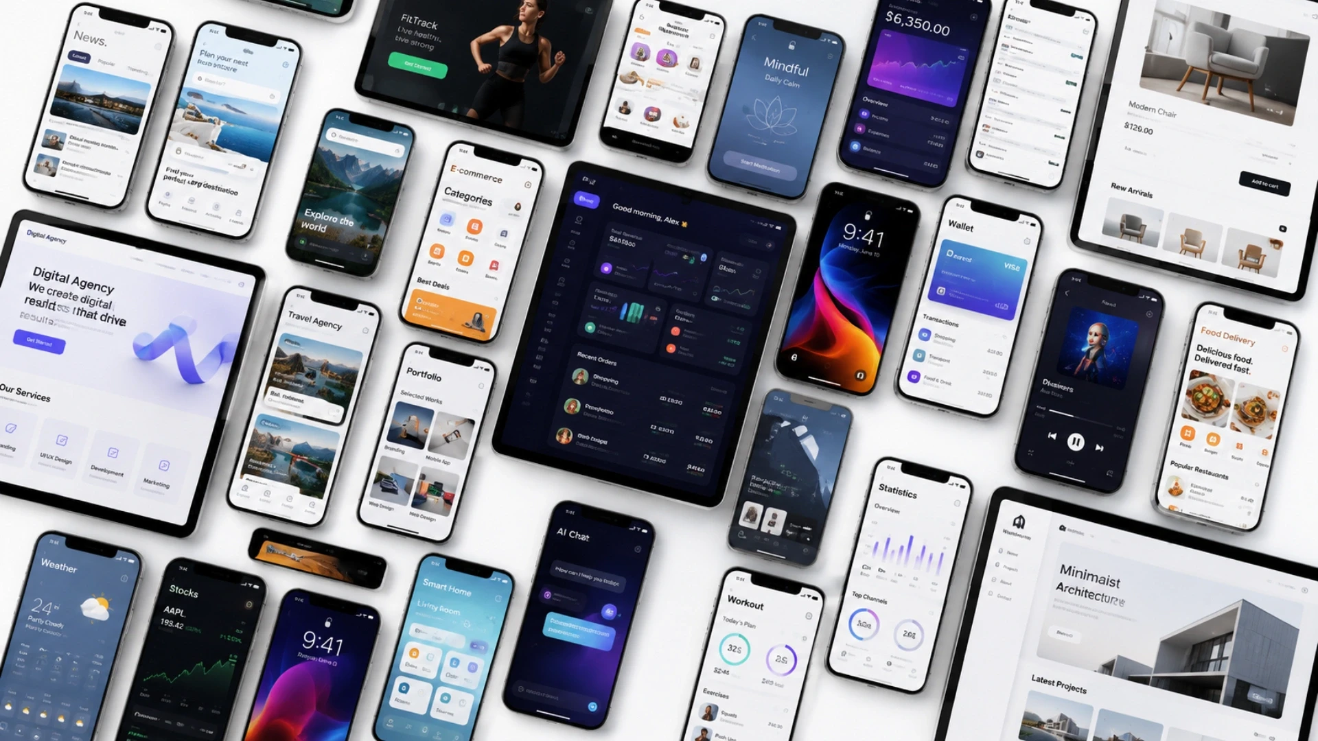
An app feels native when it follows the conventions of the platform it runs on, and each platform has its own. Ignoring these is what makes an app feel ported rather than built for the device.
iPhone users and Android users have different expectations, shaped by the design languages of their platforms. Apple sets these out in its Human Interface Guidelines, and Google in its Material Design system, and each defines how navigation, controls, gestures and typography should behave so that an app feels familiar rather than foreign. An app that ignores these conventions can feel subtly wrong to users even when they cannot say why, because it violates the habits the platform has trained into them.
The skill in cross-platform design is to share as much as sensibly possible while respecting each platform where it matters, which is exactly the balance a good design process strikes and a reason many teams pair design with a cross-platform React Native build that can honour both.
The same principle applies to visually intensive products, where a game art studio may create rich illustrations, animations, and interface assets, but those assets still need to follow platform conventions so the app feels intuitive rather than merely impressive.
How to Know Your Design Works
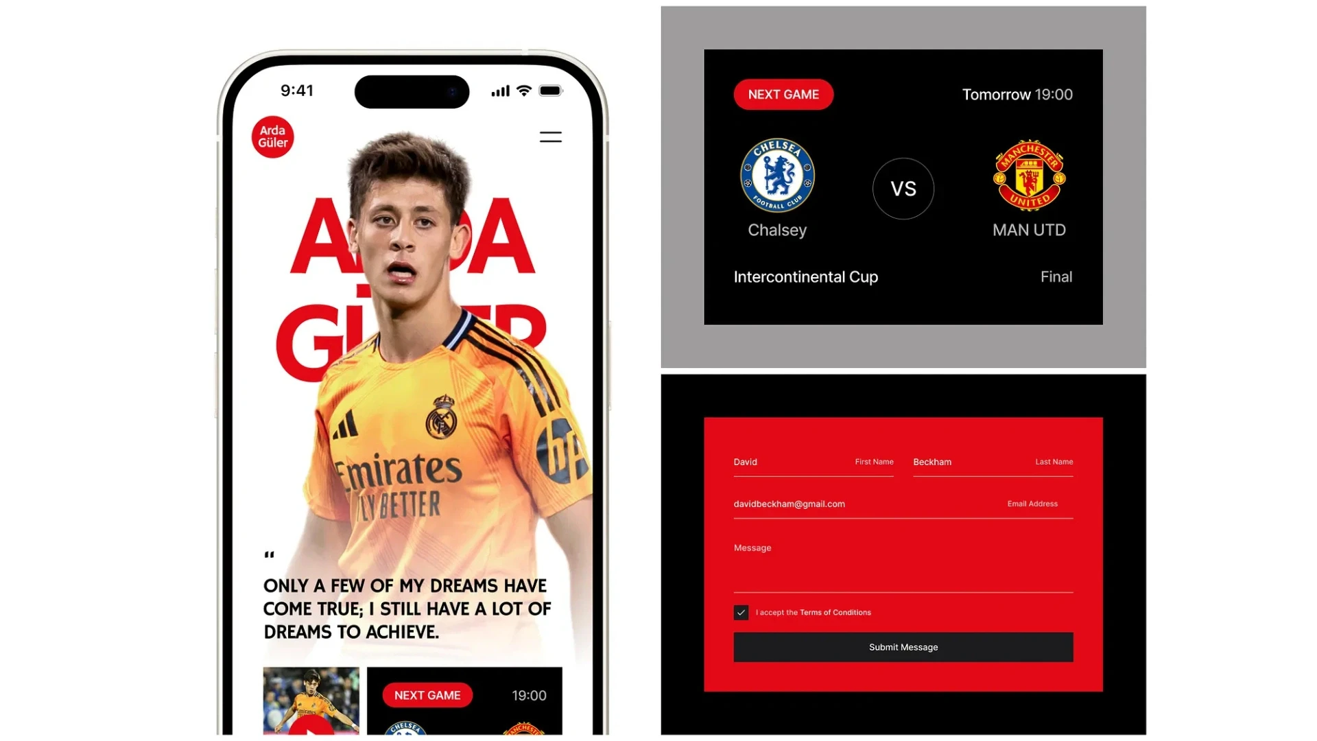
Good design is measurable, so you prove it with retention, conversion and task-success numbers rather than opinions about taste. This is how design stops being subjective and becomes accountable.
The original treated design as a matter of looking attractive, which leaves it to opinion. The better approach is to measure it. Track how many new users return after a week, how many complete the key action such as sign-up or purchase, how long a core task takes, and where people abandon a flow. These numbers tell you whether the design is working far more reliably than any debate about whether a screen looks nice.
When you change the design, watch the numbers move, and let that guide the next change. Design measured this way becomes a cycle of improvement rather than a one-time act of decoration, and keeping that cycle running is part of ongoing app support and maintenance. An app is never finished being designed; it is refined against real behaviour for as long as it lives.
Proof: Design That Made Data Usable
The clearest proof of UX design is not a prettier screen but a hard task made easy, which is exactly what good experience design does. Here is one from our own work.
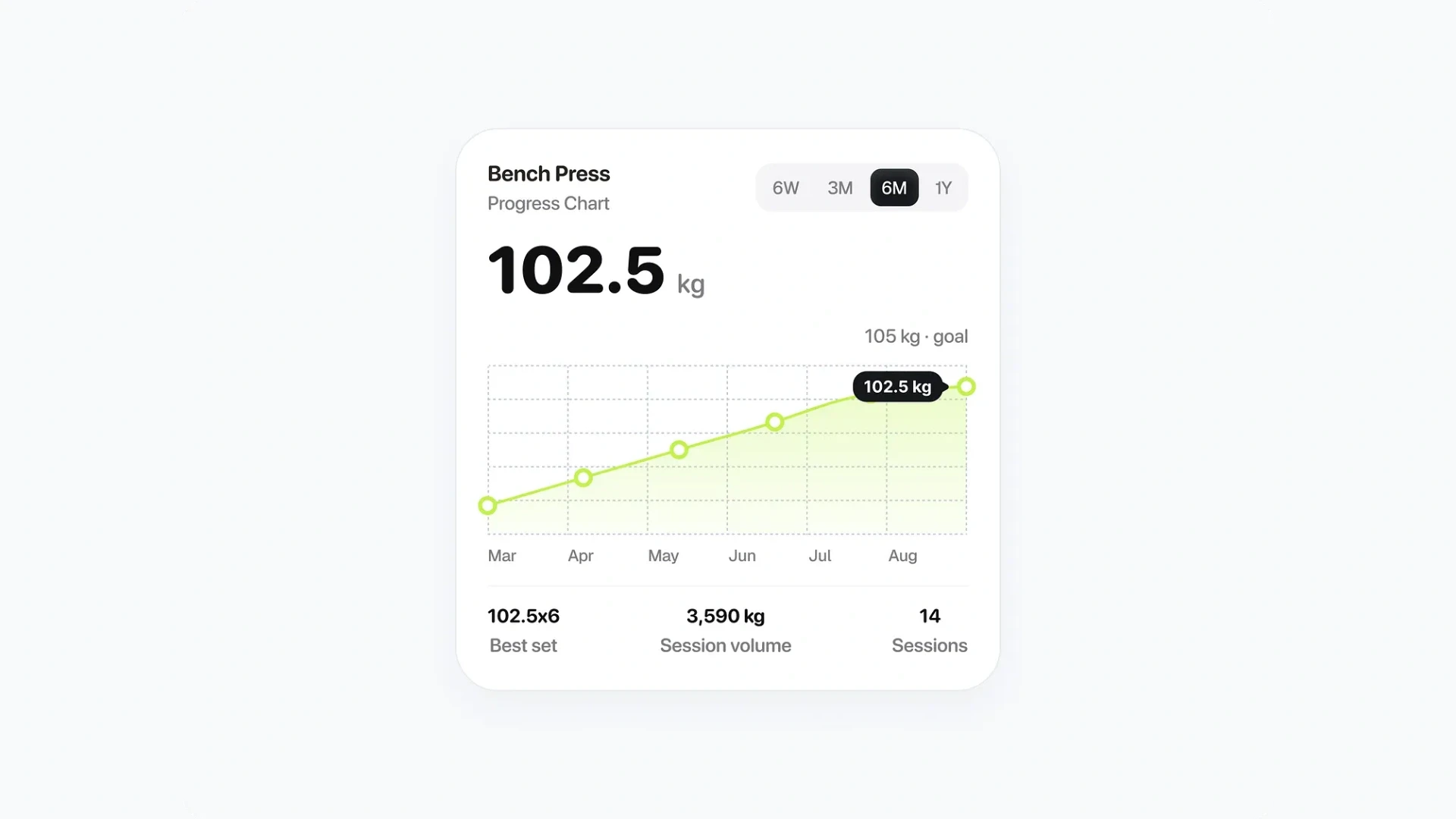
Client: Ailleron, banking technology, Krakow Ailleron's data was scattered and hard to work with. Acquaint Softtech built a set of clear, role-based dashboards that turned it into information people could actually read and act on, cutting report creation from four days to one and saving around 200 hours a week. That is UX design in its truest sense: not decoration, but taking something confusing and making it usable. The measure of success was a task that went from four days to one, rated 5.0 out of 5 on Clutch. |
The Ailleron dashboards make the article's point concrete. Their value was not that they looked good, though they did, but that they made a slow, painful task fast and simple, which is the essence of good user experience.
That sits within a verifiable record rather than a claim: 1,300+ delivered projects across 13+ years, 95% on-time sprint delivery, and 4.9 out of 5 across verified Clutch reviews, with an NDA before work begins and full client ownership of everything produced.
Because clients own everything we build, the design and the product are yours to keep refining. Our case studies and client testimonials cover the design and product work behind that record.
Want a design that moves your numbers, not just your screens?
Book a free 30-minute call, and I will introduce the designers who would work on your app and show you how they measure whether the design works.
What Good App Design Costs

Design cost scales with the depth of the work, from a visual refresh to full UX research, and it is best seen against the value it recovers. These are prevailing ranges rather than fixed quotes.
Level of design work | What it covers | Cost (USD) |
UI refresh | Visual update, existing flows | 4,000 to 15,000 |
Full UI/UX for an app | Flows, screens, design system | 15,000 to 60,000 |
UX research and testing | User research, usability testing | 10,000 to 40,000 |
Design plus build together | Design and development as one | Part of app build |
Ongoing design refinement | Measuring and improving | Retainer or per sprint |
The way to read this is against what design recovers, not just what it costs. A design investment that lifts retention or conversion pays for itself out of users you were already losing, which is why treating design as a cost to minimise is usually a false economy.
The most efficient approach is to design and build together rather than bolt design on afterward, since retrofitting a better experience onto a finished app costs far more than getting it right the first time. For a new product, our guide to building a mobile app for SaaS covers how design fits the wider build.
Where the work is done | Senior design rate | Relative cost |
New York, USA | USD 100 to 190 / hour | Highest |
United States (national) | USD 90 to 170 / hour | Very high |
Australia | AUD 110 to 200 / hour | High |
United Kingdom | GBP 65 to 130 / hour | High |
Europe (EU) | EUR 70 to 140 / hour | High |
India (Acquaint Softtech) | USD 25 to 49 / hour | Up to 40% lower |
Design and build are well-defined, testable deliverables, so they suit offshore delivery well and cost a fraction of the onshore equivalent without lowering the standard. Where you want a design-and-development team without hiring in-house, a dedicated development team or added capacity through IT staff augmentation is usually the most efficient route is often to start with a lean MVP.
Working with an MVP development company helps you validate the design with real users, gather feedback, and refine the product before investing in full-scale development.
Build an app people keep, not one they delete
Book a free 30-minute call and I will scope the design and build your app needs, with a fixed cost and timeline in your own currency.
Frequently Asked Questions
-
What is the difference between UI and UX design?
UI is how an app looks, its colours, layout, typography and icons. UX is whether it actually works for the user, its flows, structure and ease of use. An app needs both; a beautiful UI cannot save a confusing UX.
-
Why is UI/UX design important for a business app?
Because users judge and often delete an app within the first minute, based on design, not code. Good design drives retention, conversion and trust, so it directly affects the app's business results.
-
Can an app have good UI but bad UX?
Yes, and it is common. An app can look polished and modern yet frustrate people because sign-up is a maze or key actions are buried. A gorgeous interface on a confusing experience still fails.
-
What design tools are used for apps in 2026?
Figma is the industry standard, a collaborative browser-based tool. Adobe discontinued XD, and older tools have been overtaken. More important than the tool is the design system behind the app.
-
What is a design system?
A shared library of reusable components, buttons, colours, spacing and more, defined once and used everywhere. It keeps an app consistent, speeds up building, and makes future changes far easier.
-
Is app accessibility a legal requirement?
In Europe, yes. The European Accessibility Act made meeting accessibility standards a legal obligation for many businesses from June 2025. Accessible design also makes the app better for everyone.
-
How do I make my app feel native on iPhone and Android?
Follow each platform's conventions, Apple's Human Interface Guidelines and Google's Material Design, for navigation, controls and typography. Ignoring them makes an app feel subtly wrong to users.
-
How do you measure whether app design works?
By retention, conversion and task success: how many users return, how many complete key actions, how long core tasks take, and where they abandon. Numbers beat opinions about taste.
-
How much does mobile app design cost?
A UI refresh runs about USD 4,000 to 15,000, full UI/UX for an app USD 15,000 to 60,000, and UX research more. Designing and building together is more efficient than adding design later.
-
Should design come before or during development?
Together. Designing and building as one process avoids the costly retrofit of bolting a better experience onto a finished app, and keeps the design honest against how the app actually behaves.
I love to make a difference. Thus, I started Acquaint Softtech with the vision of making developers easily accessible and affordable to all. Me and my beloved team have been fulfilling this vision for over 15 years now and will continue to get even bigger and better.
Table of Contents
Get Started with Acquaint Softtech
- 13+ Years Delivering Software Excellence
- 1300+ Projects Delivered With Precision
- Official Laravel & Laravel News Partner
- Official Statamic Partner
Related Blog

Rome Was Not Built in a Day: The Journey to Developing a Unicorn SaaS
Building a unicorn SaaS company is a marathon, not a sprint. Just like Rome, great products aren’t built overnight. From refining your MVP to scaling for growth.
Mukesh Ram
September 26, 2024
10 Must Follow Steps of Mobile App Development Process
The mobile app development process is a structured set of 10 steps that moves an idea from concept to a published app: ideation, target audience and monetization, choosing the platform, UI/UX design, picking tools, choosing the right partner, fast development, testing and deployment, marketing, and post-launch maintenance. Following the steps in order, rather than rushing to publish, is what separates apps that get downloads from the ones that get ignored.
Mukesh Ram
July 29, 2019
Mobile Commerce Development: Native Apps, React Native, and PWAs for E-Commerce
Mobile commerce development is the practice of building shopping experiences for mobile devices through native apps, cross-platform React Native apps, or Progressive Web Apps. Native apps offer the highest performance and retention, React Native delivers both platforms from one codebase at 40 to 60 percent lower cost, and PWAs give app-like speed in the browser with zero install friction.

Manish Patel
June 26, 2026India (Head Office)
203/204, Shapath-II, Near Silver Leaf Hotel, Opp. Rajpath Club, SG Highway, Ahmedabad-380054, Gujarat
USA
7838 Camino Cielo St, Highland, CA 92346
UK
The Powerhouse, 21 Woodthorpe Road, Ashford, England, TW15 2RP
New Zealand
42 Exler Place, Avondale, Auckland 0600, New Zealand
Canada
141 Skyview Bay NE , Calgary, Alberta, T3N 2K6