

Top 10 Things the Best Business Website Designs Get Right in 2026
The best business website designs in 2026 get ten things right: a clear message, fast load speed, a mobile-first layout, an obvious call to action, easy navigation, strong trust signals, accessibility, a focused homepage, well-built key pages, and a design proven by results. What they share is not a look but a job done well, guiding a visitor to act without friction. Judge a design by these ten, not by whether it looks impressive in a screenshot.

Mukesh Ram
As the Founder and CEO at Acquaint Softtech, I have seen enough business websites to know that the best ones rarely have anything in common visually. They come in every style, minimalist and bold, plain and rich, and still succeed, because what makes them good is not a look but a set of things they get right.
So this is a list of those things, ranked, rather than a gallery of sites to admire, because a screenshot goes out of date in a year while the principles behind it do not. Get these ten right and your site will work, in almost any style you like. This is the checklist behind our custom web development on every project.

- You are planning a business website and want to know what good looks like.
- You have a site and want a checklist to judge whether its design works.
- You want a ranked list you can act on, not a gallery to admire.
- You are deciding what to fix first on an underperforming site.
- You want to know what a well-designed site costs and why.
A note on order. The ten are ranked roughly by how much they decide whether a visitor stays and acts, so the earlier items carry more weight than the later ones. That said, a good design needs all ten; a site can nail its message and still fail if it loads slowly or breaks on a phone. Treat the list as a whole, and use the ranking to decide what to fix first if you cannot do everything at once.
A Clear Message in Seconds
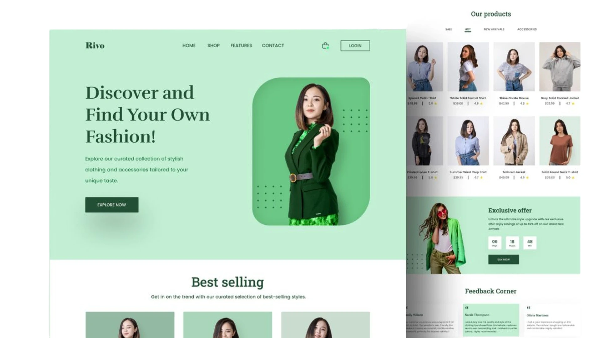
The best designs tell a visitor what the business does and who it is for within seconds of the page loading. If a visitor cannot tell what you offer, nothing else about the design matters.
A visitor arrives with a question, is this for me, and a good design answers it immediately, in plain words, above the fold. The most common failure is a clever headline that sounds impressive but says nothing, leaving the visitor to guess.
The best sites resist that: they state the offer clearly first and save the personality for once the visitor understands what they are looking at. Clarity of message is ranked first because it is the gate; a visitor who does not understand your offer in the first few seconds never reaches the rest of your design.
Fast Load Speed
The best designs load fast, because a slow site loses visitors before they see anything and ranks lower in search. Speed is a design decision, not just a technical one.
Every extra second of load time sheds visitors, most sharply on mobile, and Google measures speed directly through its Core Web Vitals, which affect both experience and ranking. This is where the original version of this topic went wrong by recommending heavy sliders and large banners; those are exactly what slows a page down.
The best designs treat performance as part of the design itself, compressing images, trimming scripts, and measuring against a real standard, and keeping a site fast as it grows is ongoing work for whoever you hire DevOps engineers to own it. A beautiful design nobody waits for is not a good design.
A Mobile-First Layout
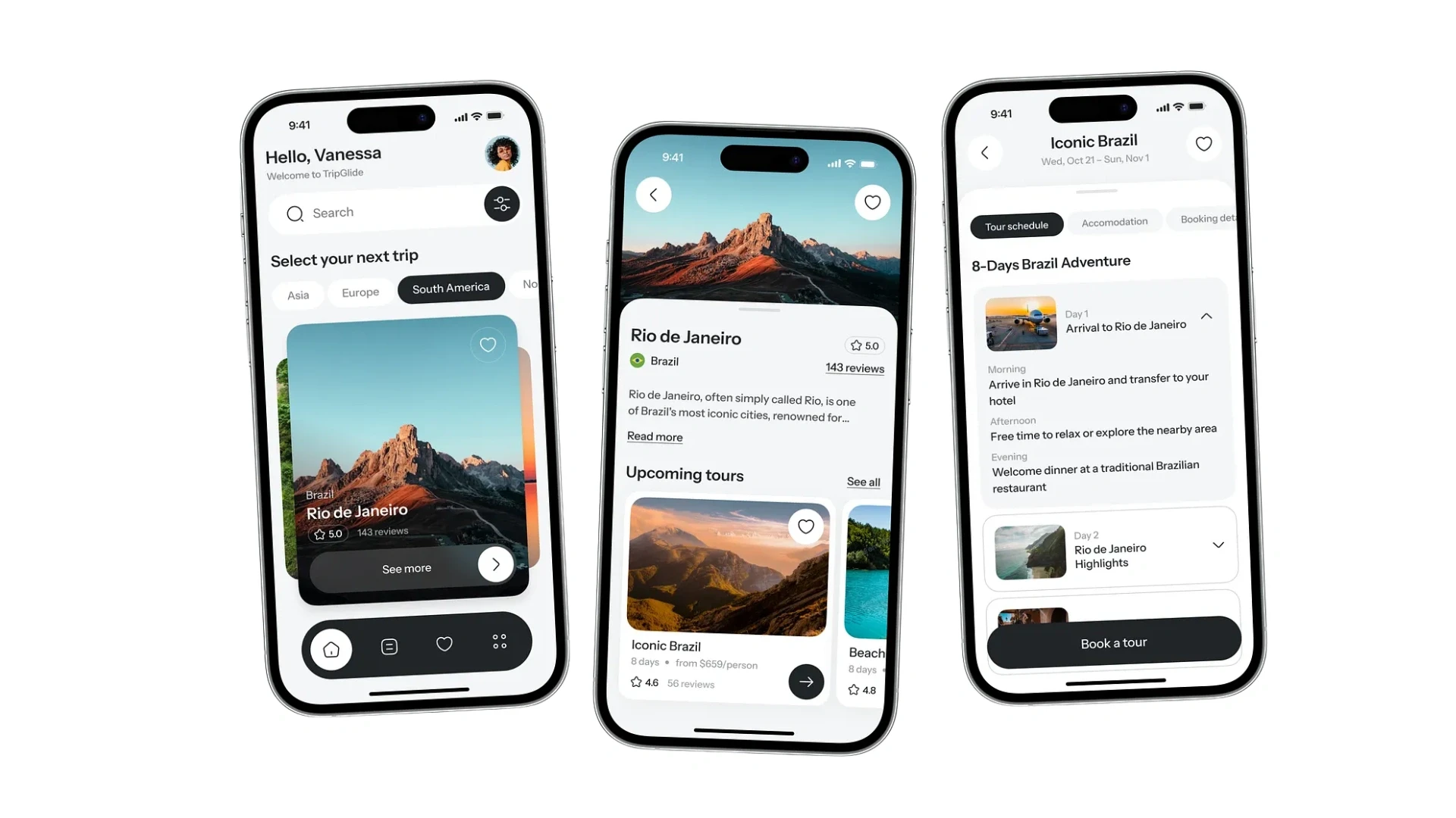
The best designs are built for the phone first, because most visitors now arrive on one. A design that only works on a desktop is a design that fails most of its audience.
Mobile-first means designing for the small screen as the primary experience and expanding to larger ones, rather than shrinking a desktop layout and hoping. It forces the discipline the best sites have anyway: decide what truly matters, because there is no room for clutter on a phone.
Touch targets large enough to tap, text readable without zooming, and a layout that reflows cleanly are baseline, not bonus. A design reviewed only on a big monitor will disappoint the majority of real visitors, which is why the best teams check every screen on an actual phone before it ships.
One Obvious Call to Action
The best designs make the single most important action unmistakable on every page. A site that wants everything equally gets none of it.
Whether the goal is a purchase, an enquiry, a booking or a sign-up, the best designs name it and make it the clearest thing on the page, using colour, position and space to draw the eye to it. The common mistake is a page full of equally weighted options, which leaves the visitor to decide what to do and often to do nothing.
Decide the one action that matters most on each page and let the design point at it. This clarity of intent, more than any decorative flourish, is what turns a visitor into a customer, and settling those goals early is part of a discovery workshop.
Navigation That Never Makes You Think
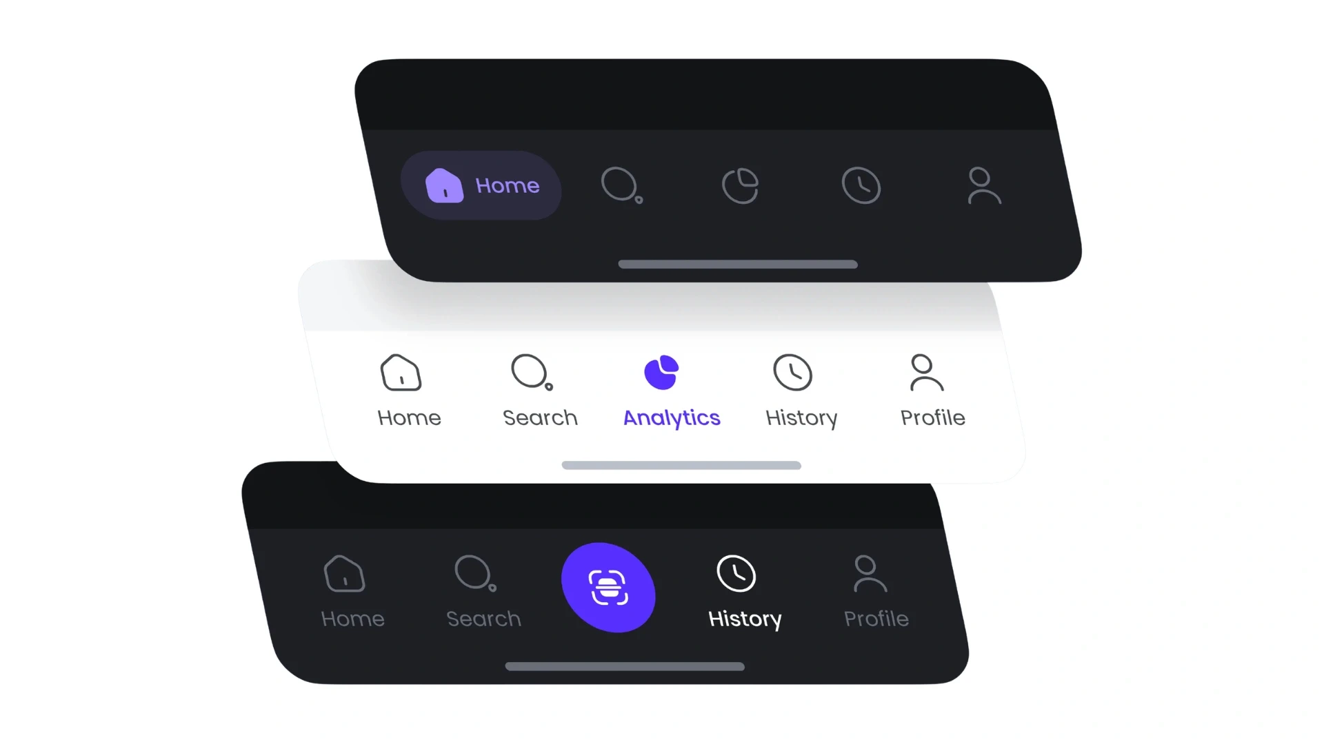
The best designs put links exactly where people expect them, so finding anything takes no effort. Predictable navigation is a feature, not a lack of imagination.
Primary navigation at the top, important secondary links, contact, about, policies, in the footer, and nothing essential more than a click or two away: this is what people have been trained to expect, and the best sites honor it. Clever, unconventional navigation may impress other designers, but it frustrates a visitor in a hurry, who simply leaves.
Want to know how your site scores on these ten?
Send me your site and I will rate it against this list, point out where it is leaking visitors, and tell you what to fix first.
Trust Signals in the Right Places
The best designs earn trust visibly, with proof placed where a visitor is deciding whether to believe you. Design is not only how a site looks; it is whether it feels credible.
Reviews, client logos, testimonials, security indicators, clear contact details and real photographs all tell a visitor that the business is genuine and safe to deal with. The best designs place these deliberately, near the point of decision, so a visitor about to buy or enquire sees a reason to trust just when they need it.
A site with no visible proof asks the visitor to take a leap of faith, and many will not. Trust signals are a design element, not an afterthought, and arranging them well is one of the quiet differences between a site that converts and one that merely looks nice.
Accessibility Built In
The best designs work for everyone, and in 2026 that is not just good practice; in Europe it is the law. An inaccessible design excludes people and now carries legal risk.
Accessible design means sufficient color contrast, text that scales, navigation that works without a mouse, and compatibility with screen readers. The standard is the Web Content Accessibility Guidelines, and the European Accessibility Act made meeting standards like these a legal obligation for many businesses from June 2025.
The best designs build this in from the start, and they benefit twice: they reach a wider audience and they satisfy the law, while gaining the clarity that accessible design brings to every visitor. A 2019 best-design list could ignore this; a 2026 one that did would be incomplete and, for many businesses, non-compliant.
A Focused Homepage, Not a Slideshow
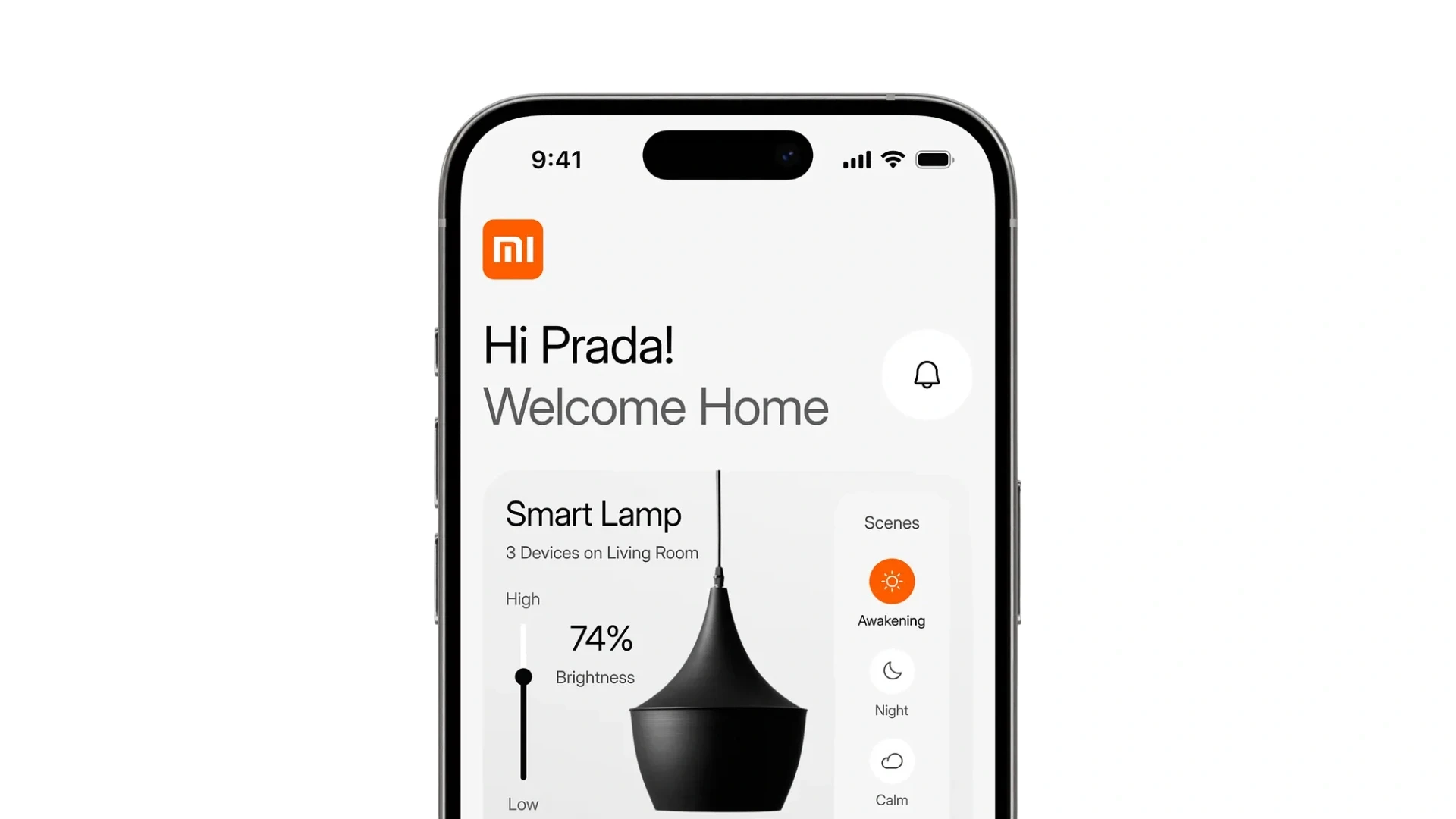
The best homepages make one clear point and offer one clear path, rather than cycling through a slideshow of messages. This directly corrects the old advice to lead with a rotating slider.
An earlier version of this topic recommended a homepage slider to hold attention. The evidence now points firmly the other way: sliders slow the page, most visitors ignore all but the first slide, and rotating messages dilute rather than focus.
The best homepages state plainly what the business offers and who for, present one obvious action, and show enough proof to reassure, all loading quickly. A focused homepage that says one thing well beats a busy one that says five things poorly, and that focus is a sign of confident design rather than a shortage of ideas.
Key Pages That Do Their Job
The best designs treat every key page as having a job, and design each to do it well. Most of a site's work happens on a handful of pages beyond the homepage.
The about page earns trust by explaining why you exist and why to choose you, in the visitor's terms, not as a dump of company history. The contact page removes every barrier to getting in touch, with a simple form and clear options rather than obstacles.
The blog earns search visibility and demonstrates expertise, but only if it is readable and genuinely useful rather than written for keywords. The best designs give each of these pages the same care as the homepage, because a strong homepage that leads to weak inner pages still loses the visitor.
A Design Proven by Results
The best designs are validated by what they achieve, retention, conversion, completed actions, not by how they look in a portfolio. This is the difference between a design that is admired and one that works.
A design can win visual praise and still underperform, and a plain one can quietly outperform it, so the best teams measure. They watch how long visitors stay, how many complete the key action, and where people abandon a flow, and they refine the design against those numbers rather than against opinion.
This is what separates professional design from decoration: it is accountable to results. A design you can defend with clarity, speed, accessibility and conversion data is a good one, and keeping that measurement running after launch is part of ongoing support and maintenance. A site is never finished being designed; it is improved against real behavior for as long as it lives.
The 10 in One View
Here is the full list in order, with the single question each item answers. Use it as a checklist against any business website, including your own.
# | What the best designs get right | The question it answers |
1 | A clear message | Does a visitor grasp the offer in seconds? |
2 | Fast load speed | Does it load before people leave? |
3 | Mobile-first layout | Does it work on a phone? |
4 | One obvious call to action | Is the next step unmistakable? |
5 | Effortless navigation | Can people find things without thinking? |
6 | Trust signals | Is there visible reason to believe you? |
7 | Accessibility | Can everyone use it, lawfully? |
8 | A focused homepage | Does it say one thing well? |
9 | Strong key pages | Do about, contact and blog do their jobs? |
10 | Proven by results | Do the numbers show it works? |
Proof: Design Measured by Results
The tenth item, proven by results, is the one that matters most, so here is what it looks like in our own work. Real proof is an outcome, not a screenshot.
Client: Ailleron, banking technology, Krakow Ailleron's information was scattered and hard to use. Acquaint Softtech designed clear, role-based dashboards that turned it into something people could read and act on, cutting report creation from four days to one and saving around 200 hours a week. That is the tenth item in action: a design judged by results, a hard task made easy, rated 5.0 out of 5 on Clutch. No screenshot conveys that; the outcome does. |
The Ailleron work shows why we rank results last but weight them most. Its design succeeded not because it looked impressive but because it made a slow, painful task fast and simple, the only test of design that finally counts.
That sits within a verifiable record rather than the self-praise a showcase relies on: 1,300+ delivered projects across 13+ years, 95% on-time sprint delivery, and 4.9 out of 5 across verified Clutch reviews, with an NDA before work begins and full client ownership of everything produced. Because you own everything we build, the design is yours to keep and improve. Our case studies and client testimonials cover the design work behind that record, across the USA, UK and Europe.
Want a design judged by results, not just looks?
Book a free 30-minute call and I will review your site against all ten and show you what a stronger, faster, clearer design would change.
What a Well-Designed Website Costs
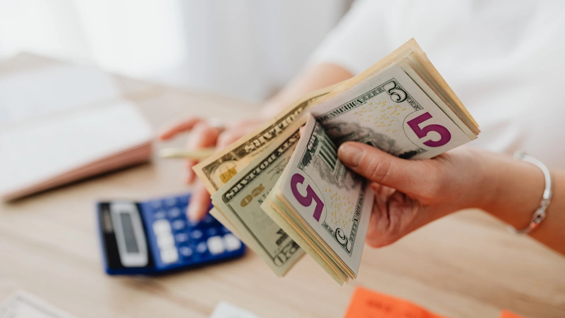
The cost of getting these ten right scales with the size of the site and the depth of the work, and is best read against the visitors a better design keeps. These are prevailing ranges rather than fixed quotes.
Type of design work | What it covers | Cost (USD) |
Small business site design | A few key pages, all ten applied | 4,000 to 15,000 |
Full business site design | Many pages, clear system | 15,000 to 50,000 |
Design plus build together | Design and development as one | 20,000 to 80,000 |
Redesign of an existing site | Fixing speed, clarity, access | 8,000 to 40,000 |
Ongoing design upkeep | Measuring and improving | Retainer or per sprint |
Read the cost against what good design recovers. A clearer, faster, more accessible site converts more of the visitors you already have, so the design pays for itself out of the traffic you were otherwise losing, which is why treating design as a cost to minimize is usually a false economy.
Designing and building together beats commissioning a pretty design that then proves slow or hard to build. Our guide to web application development cost sets out how design fits a wider budget.
Where the work is done | Senior design rate | Relative cost |
New York, USA | USD 100 to 190 / hour | Highest |
United States (national) | USD 90 to 170 / hour | Very high |
Australia | AUD 110 to 200 / hour | High |
United Kingdom | GBP 65 to 130 / hour | High |
Europe (EU) | EUR 70 to 140 / hour | High |
India (Acquaint Softtech) | USD 25 to 49 / hour | Up to 40% lower |
Design and build are well-defined, testable deliverables, so they suit offshore delivery well and cost a fraction of the onshore equivalent without lowering the standard. Where you want the work done alongside an existing team, adding capacity through IT staff augmentation is often quickest, and for a new venture a lean MVP development services tests the design with real visitors before building the full site.
Build a site that works as well as it looks
Book a free 30-minute call and I will scope your design and build with a fixed cost and timeline in your own currency.
Frequently Asked Questions
-
What makes the best business website designs good?
Ten things: a clear message, fast speed, mobile-first layout, one obvious call to action, easy navigation, trust signals, accessibility, a focused homepage, strong key pages, and a design proven by results.
-
Is a pretty website the same as a well-designed one?
No. A site can look impressive and fail because it is slow or confusing, while a plain one can succeed because it is fast and clear. Judge design by whether it works, not by a screenshot.
-
What is the most important element of website design?
A clear message. If a visitor cannot tell what you offer and who it is for within seconds, nothing else about the design gets a chance to matter, which is why it ranks first.
-
Should a business website use a homepage slider?
Usually not. Sliders slow the page, harm Core Web Vitals, and most visitors ignore all but the first slide. A focused homepage with one clear message and action works better.
-
Why does website speed matter for design?
A slow site loses visitors before they see it and ranks lower in search. Speed, measured by Core Web Vitals, is part of good design, not a separate technical concern.
-
Is accessible website design legally required?
In Europe, yes. The European Accessibility Act made meeting accessibility standards a legal obligation for many businesses from June 2025, and accessible design is better for everyone.
-
What are the most important pages on a business website?
The homepage, about, contact and blog do most of the work. The best designs give each the same care, since a strong homepage leading to weak inner pages still loses the visitor.
-
How do I judge whether my website design is good?
Score it against the ten here, then check the numbers: how long visitors stay, how many complete key actions, and where they leave. Evidence beats opinions about taste.
-
How much does a well-designed business website cost?
A small business site runs about USD 4,000 to 15,000, a full site USD 15,000 to 50,000, and design plus build more. Read the cost against the visitors a better design keeps.
-
Should design and development happen together?
Yes. Designing and building as one process avoids a pretty design that proves slow or hard to build, and keeps the design honest against how the site actually performs.
I love to make a difference. Thus, I started Acquaint Softtech with the vision of making developers easily accessible and affordable to all. Me and my beloved team have been fulfilling this vision for over 15 years now and will continue to get even bigger and better.
Table of Contents
Get Started with Acquaint Softtech
- 13+ Years Delivering Software Excellence
- 1300+ Projects Delivered With Precision
- Official Laravel & Laravel News Partner
- Official Statamic Partner
Related Blog
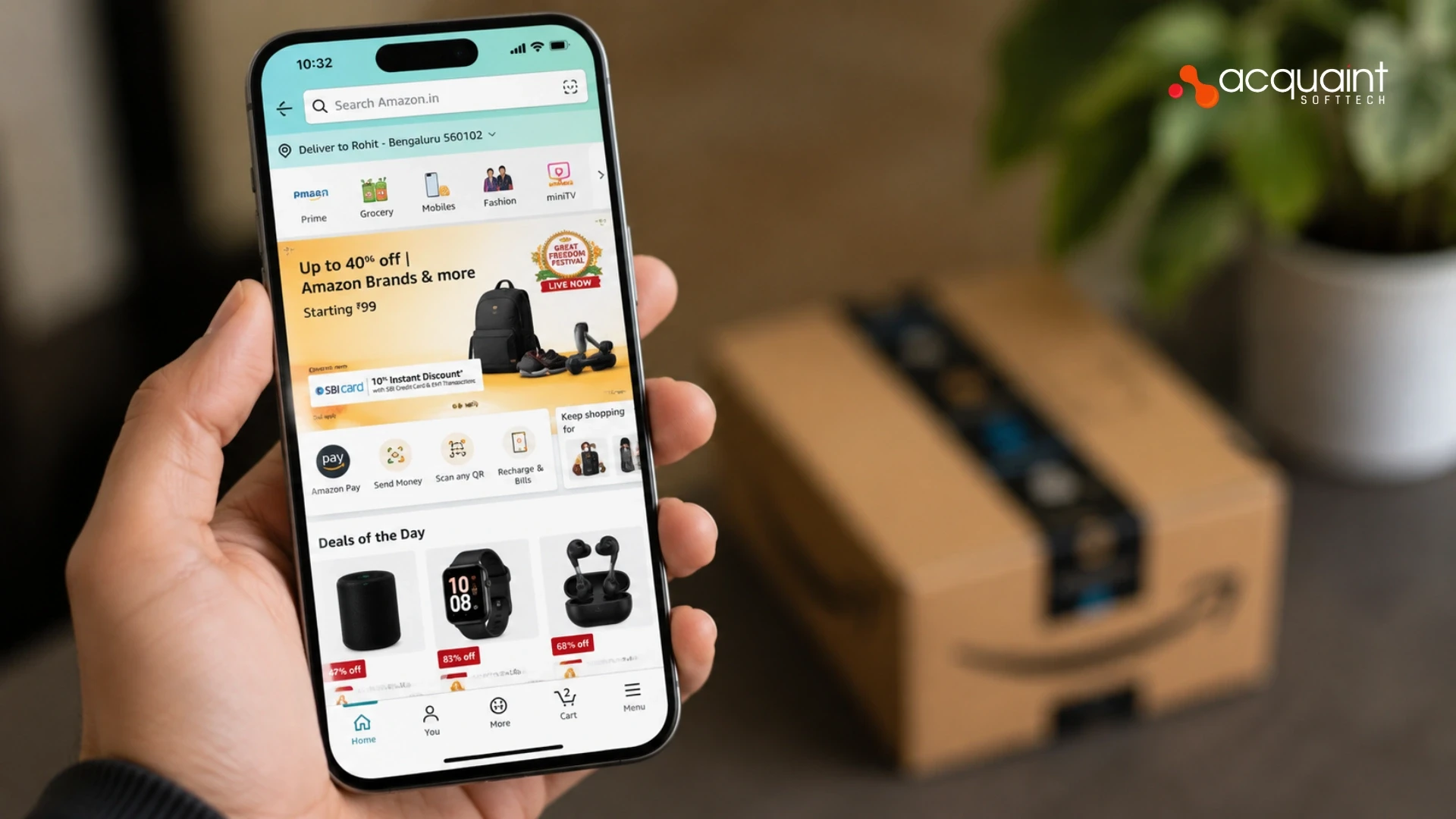
Mobile Commerce Development: Native Apps, React Native, and PWAs for E-Commerce
Mobile commerce development is the practice of building shopping experiences for mobile devices through native apps, cross-platform React Native apps, or Progressive Web Apps. Native apps offer the highest performance and retention, React Native delivers both platforms from one codebase at 40 to 60 percent lower cost, and PWAs give app-like speed in the browser with zero install friction.

Manish Patel
June 26, 2026
Rome Was Not Built in a Day: The Journey to Developing a Unicorn SaaS
Building a unicorn SaaS company is a marathon, not a sprint. Just like Rome, great products aren’t built overnight. From refining your MVP to scaling for growth.
Mukesh Ram
September 26, 2024
Bootstrap vs Material
Develop a state-of-the-art solution by picking the best technology after reading more about Bootstrap and Material UI

Shivang P
September 4, 2023India (Head Office)
203/204, Shapath-II, Near Silver Leaf Hotel, Opp. Rajpath Club, SG Highway, Ahmedabad-380054, Gujarat
USA
7838 Camino Cielo St, Highland, CA 92346
UK
The Powerhouse, 21 Woodthorpe Road, Ashford, England, TW15 2RP
New Zealand
42 Exler Place, Avondale, Auckland 0600, New Zealand
Canada
141 Skyview Bay NE , Calgary, Alberta, T3N 2K6