How to Design an Effective eLearning Platform: Best Practices and Tips
How to make an eLearning website with the best practices and tips, let's explore in detail in this blog to build a successful e-learning platform.

Mukesh Ram
Introduction
Online training is very popular in different industries, such as education, training, culture, art and other industries. Developing an eLearning platform not only provides a good platform for your business but also offers an impressive platform for the visitors and students.
Developing an effective eLearning platform is crucial to user engagement, with a seamless learning experience to drive conversions. In this article, we will explore the best practices and tips for eLearning platform development that will enhance user experience and maximize the impact of your online courses.
Understand Your Users and Their Needs

When you're developing an eLearning platform, it's important to consider your target audience. A good eLearning platform is one that lives up to the expectations of the users and allows them to navigate to the content they desire with ease. The more you know about them, the better you can design a learning experience that meets their needs.
Researching your users will help you understand where their pain points lie and what they want from their platform. Conduct thorough research to understand their preferences, learning habits, and more.
Conducting surveys is another way to gather information from potential customers. You can also conduct interviews with members of your team who have interacted with your target audience.
Knowing your audience also ensures you are one step ahead of your competition. You can equip yourself with this knowledge prior to contacting the experts for the development of your eLearing platform. It is a good practice to have a clear picture of your requirements prior to approaching them.
For example, if you hire remote developer to do your job, they first ask what type of website you need. To answer that you must have a plan back in your head. And having information about your targeted audience can solve many problems related to this question.
How to design an eLearning Website?
We have discussed some of the important reasons why you need a website and why it's crucial to understand your users and their needs.
Now that you know the importance of developing a website and what it takes, it is time to start designing a website; we will discuss all the best practices to design an effective eLearning platform.
Create an Intuitive and User-Friendly Interface
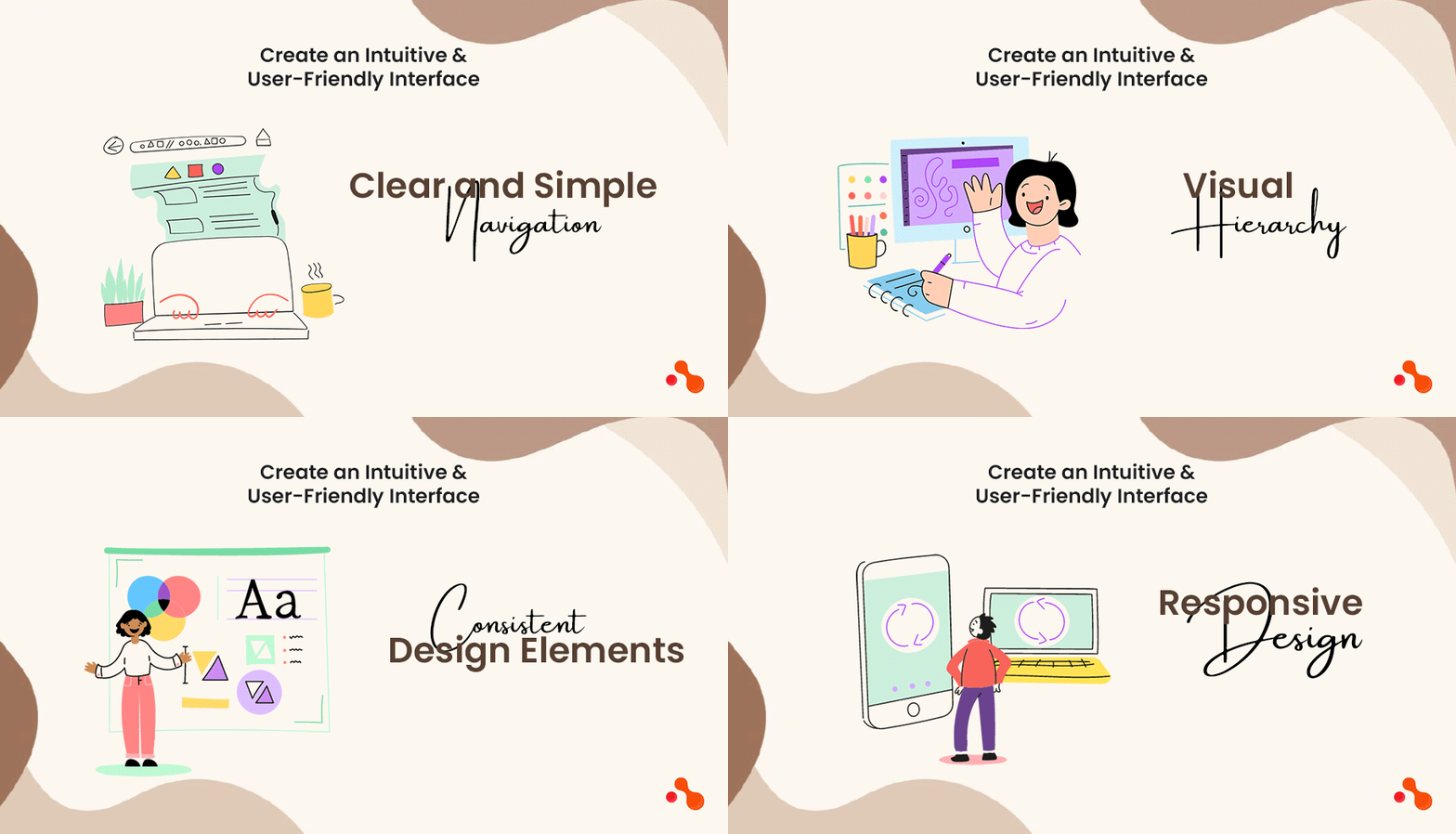
The interface of your eLearning platform should be intuitive and user-friendly, allowing users to navigate seamlessly through the courses and lessons. Consider the following design elements to enhance usability:
Clear and Simple Navigation
Implement a clear navigation menu that organizes the courses and lessons logically. Use concise and descriptive labels to guide users and make it easy for them to find what they are looking for.
Visual Hierarchy
Establish a visual hierarchy to prioritize important elements and draw users attention. Use font sizes, colours, and spacing to differentiate between headings, subheadings, and body text. This will make it easier for users to scan the content and locate key information.
Consistent Design Elements
Maintain consistency in the platform's design elements, such as buttons, fonts, colours, and icons. Consistency creates a sense of familiarity and makes the platform more user-friendly. Consistency is only possible when you take the right planning approach, so it's crucial that you hire a remote developer that has experience working to build an eLearning Platform.
Responsive Design
Ensure that your eLearning platform is optimized for different devices and screen sizes. A responsive design will provide a seamless experience for users accessing the platform from desktops, laptops, tablets, and smartphones.
Also Read: Hire Remote Developers or an Entire Development Team - The Complete Guide
Engage Users with Compelling Visuals
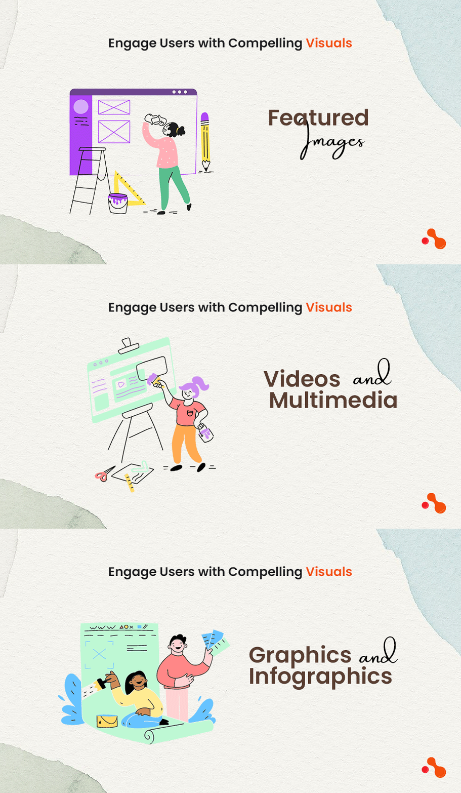
Visual elements play a crucial role in creating an engaging eLearning platform. Here are some key considerations when incorporating visuals into your design:
Featured Images
Use high-quality and relevant featured images to capture the users attention and convey the essence of the courses. Images should be visually appealing and closely related to the course's subject matter. It will help users make informed decisions about which courses to enrol in.
Videos and Multimedia
Integrate videos and multimedia content to enhance the learning experience. Videos can explain complex concepts, provide demonstrations, or showcase examples. Ensure that the videos are high-quality, well-edited, and have clear audio.
Graphics and Infographics
Integrate videos and multimedia content to enhance the learning experience. Videos can explain complex concepts, provide demonstrations, or showcase examples. Ensure that the videos are high-quality, well-edited, and have clear audio.
Transform your eLearning vision into reality.
Enhance your eLearning platform with a tailor-made website to fit your needs. Schedule a complimentary 30 min call with our skilled professionals for a personalized consultation and project estimation. Kickstart your development journey today. Your dream platform awaits!
Optimize the Learning Curve
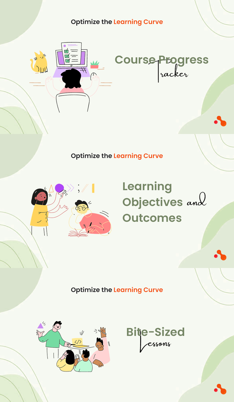
The learning curve refers to the gradual progression of difficulty and complexity in the courses and lessons. Design your eLearning platform to ensure a smooth learning curve for users. Consider the following tips:
Course Progress Tracker
Implement a course progress tracker that allows users to track their progress within a course. Progress tracking will give users a sense of accomplishment and motivate them to continue learning.
Learning Objectives and Outcomes
Communicate the learning objectives and outcomes for each course. Think of it like an introduction. It will help users understand what they can expect to achieve by completing the course and motivate them to stay engaged.
Bite-Sized Lessons
Break down the content into bite-sized lessons to prevent overwhelming users with too much information at once. The approach of using bit-sized lessons is to allow users to learn quickly and retain information more effectively.
Design for Accessibility
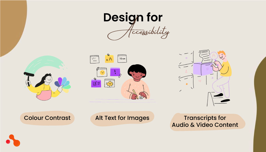
Accessibility is a crucial aspect of eLearning platform design, as it ensures that all users, including those with disabilities, can access and navigate the platform effectively. Consider the following accessibility guidelines:
Colour Contrast
Ensure that there is sufficient colour contrast between the text and background to make the content readable for users with visual impairments. Use online tools to check the colour contrast ratio and make necessary adjustments.
Alt Text for Images
Provide descriptive alt text for images to assist users with visual impairments who rely on screen readers to access the content. Alt text should accurately describe the image and its purpose in the context of the course.
Transcripts for Audio and Video Content
Include transcripts for audio and video content to accommodate users who are deaf or hard of hearing. Transcripts allow them to access the information presented in audio or video format.
Implement Effective Call-to-Action Buttons

Call-to-action (CTA) buttons are vital in guiding users towards desired actions, such as enrolling in a course or accessing additional resources. Here are some tips for designing effective CTAs:
Placement
Strategically place CTAs in areas that are easily visible to users. Consider placing them at the end of course descriptions or lessons and on relevant pages where users might be inclined to take action.
Design
Make CTAs visually appealing by using contrasting colours and clear, concise text. The design should make them stand out from other elements on the page.
Language
Use persuasive and action-oriented language in your CTAs to motivate users to take the desired action. Communicate the benefits or value they will gain by clicking the button.
Continuously Test and Improve
Designing an effective eLearning platform is an ongoing process. Continuously collect user feedback, analyze user behavior data, and conduct usability tests to identify areas for improvement. Use this data to make data-driven design decisions and optimize the platform for better user experience and engagement.
We have covered all the essential points for building a website. However, creating an eLearning platform for various types of businesses requires a different perspective. Like making different types of cars involves the same process but serves different purposes, an eLearning platform for art websites will differ from one offering MVP development courses. To illustrate this, let's use our recent case study of a website designed for artists.
A Case Study: Building an eLearning Platform for an Artist
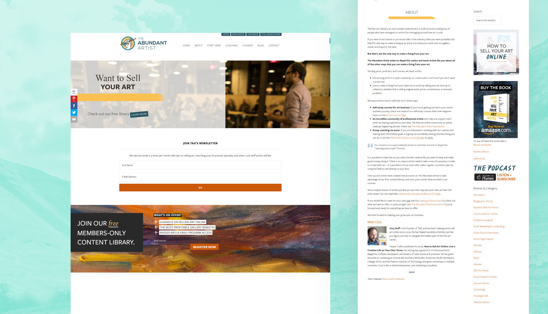
As a leading web and Laravel development solution provider, we worked with different types of business projects. Recently our team worked with Abundant Artist to make an eLearning platform for artists to teach about selling Art.
We incorporated all crucial elements for the website for the eLearning platform. For example, we also included access to a big community of professional artists and a useful library of resources.
Features
Browse through courses
Payment gateway
Resource library for members
Member login
Robust search feature
Newsletter
Blog
Podcast
Conclusion
Designing an effective eLearning platform requires a deep understanding of your target audience, careful attention to user experience, and implementing design best practices.
By creating an intuitive and user-friendly interface, incorporating compelling visuals, optimizing the learning curve, and considering accessibility guidelines, you can design a platform that engages users and enhances their learning experience.
Continuous testing and improvement will ensure that your eLearning platform remains effective and meets the evolving needs of your users.
Also Read: Types of E-learning Platforms?
FAQ: How to Design an Effective eLearning Platform: Best Practices and Tips
-
What is an eLearning platform, and why is it important?
An eLearning platform is a digital learning environment that facilitates the delivery of educational content and training materials to learners through the Internet. It is essential because it offers flexible and accessible learning opportunities, enabling learners to acquire knowledge and skills conveniently and conveniently.
-
What are the key features to include in an effective eLearning platform?
Some essential features include a user-friendly interface, multimedia support, interactive assessments, progress tracking, and seamless content delivery across devices.
-
How much does it cost to build an e-learning website?
The cost to build an eLearning platform can vary widely depending on the platform's complexity, features, and customization requirements. A basic eLearning platform may cost around $5,000 to $10,000, while a more comprehensive and customized solution could range from $20,000 to $100,000 or more. Content development, integrations, and ongoing maintenance influence the overall cost.
-
How much time does it take to build an eLearning website from scratch?
Building a basic eLearning website may take 2 to 6 months, while a more complex and customized platform could take 6 to 12 months or longer. It depends on the requirement and experience level of the developer. If you plan to include a wide variety of features in your website, it will take some extra time and effort to build a website per your needs.
Table of Contents
Get Started with Acquaint Softtech
- 13+ Years Delivering Software Excellence
- 1300+ Projects Delivered With Precision
- Official Laravel & Laravel News Partner
- Official Statamic Partner
